CodeYourBrand · 2024–2026
TwoContinents Website redesign
A research-led redesign of a travel e-commerce in Dubai: an audit and the first product analytics, a five-stage roadmap and a custom design system of 50+ components built together with the developers.
E-commerce · UX Research · Design System · WCAG · Roadmap

- Context
- TwoContinents sells attractions, trips and stays in Dubai. At CodeYourBrand, a software house, I led the design of its customer website from September 2024.
- My role
- Product Designer, the only designer on the project until I hired and onboarded a second one: research, UX/UI, the design system, the roadmap and QA with developers.
- The Problem
- The website had low WCAG standards, usability issues and weak brand recognition, and there was no product data: nobody knew where users left the page, or why.
- Outcome
- A design system that every new module is built on, a hand-off developers could build from without guessing, and 40% more issues caught on dev before production.
01 · What was unclear
There was no product data. Design decisions were opinions, and every redesign idea was a guess.
- No product analytics and no research, so nobody could say where users dropped off or why. Google Tag Manager was on the site, but only TWC's ads team used it.
- The UI was inconsistent, failed accessibility basics and did little for recognition of the brand. On the old product page, the gold price labels had a contrast of about 1.95:1 on white, where WCAG asks for 4.5:1.
- Constraints: one designer, and a website that had to keep selling during the redesign.
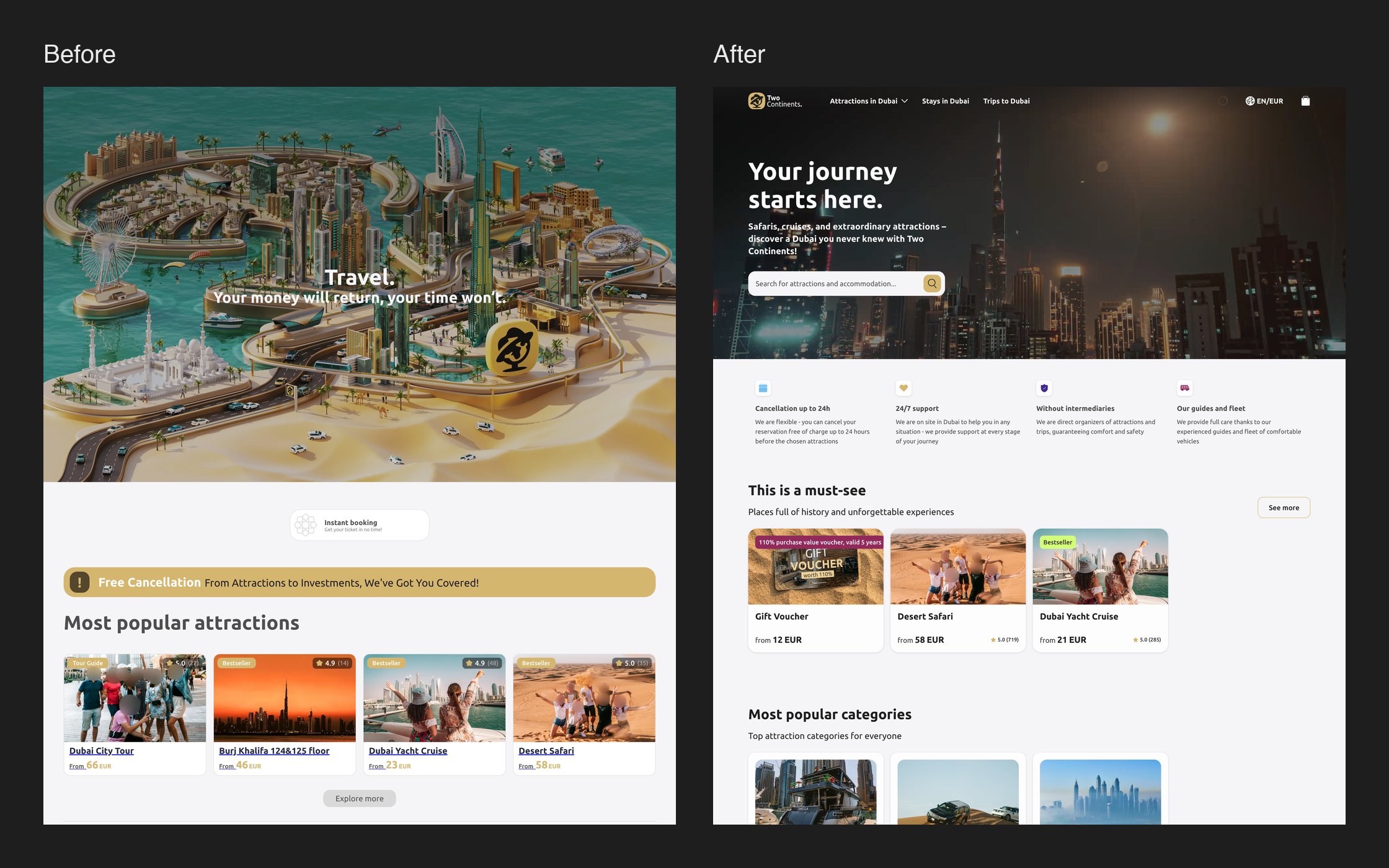
02 · Research
I put measurement in place before changing a single screen.
- A WCAG and heuristic audit, a few pages long, with every issue prioritised.
- Hotjar, Maze and on-site surveys to close the data gap, and a benchmark of Booking, Airbnb and wakacje.pl.
- A one-month Hotjar survey surfaced concrete pain points that stakeholders couldn't argue with: navigation, unclear views of trip offers, and key information that was hard to find, like how to contact support.
03 · Roadmap and decisions
Each big call had a faster alternative. I chose based on what the research showed and what the team could carry.
- Big-bang redesign or phased rollout? Phased: five stages of 1–3 months, starting with consistency, accessibility and core usability, so conversion could grow between stages instead of riding on one launch.
- The most critical issues were solved within six months, including a custom design system built for the client's needs.
- WCAG as the baseline, decided before visual design, so accessibility didn't force rework at the end.
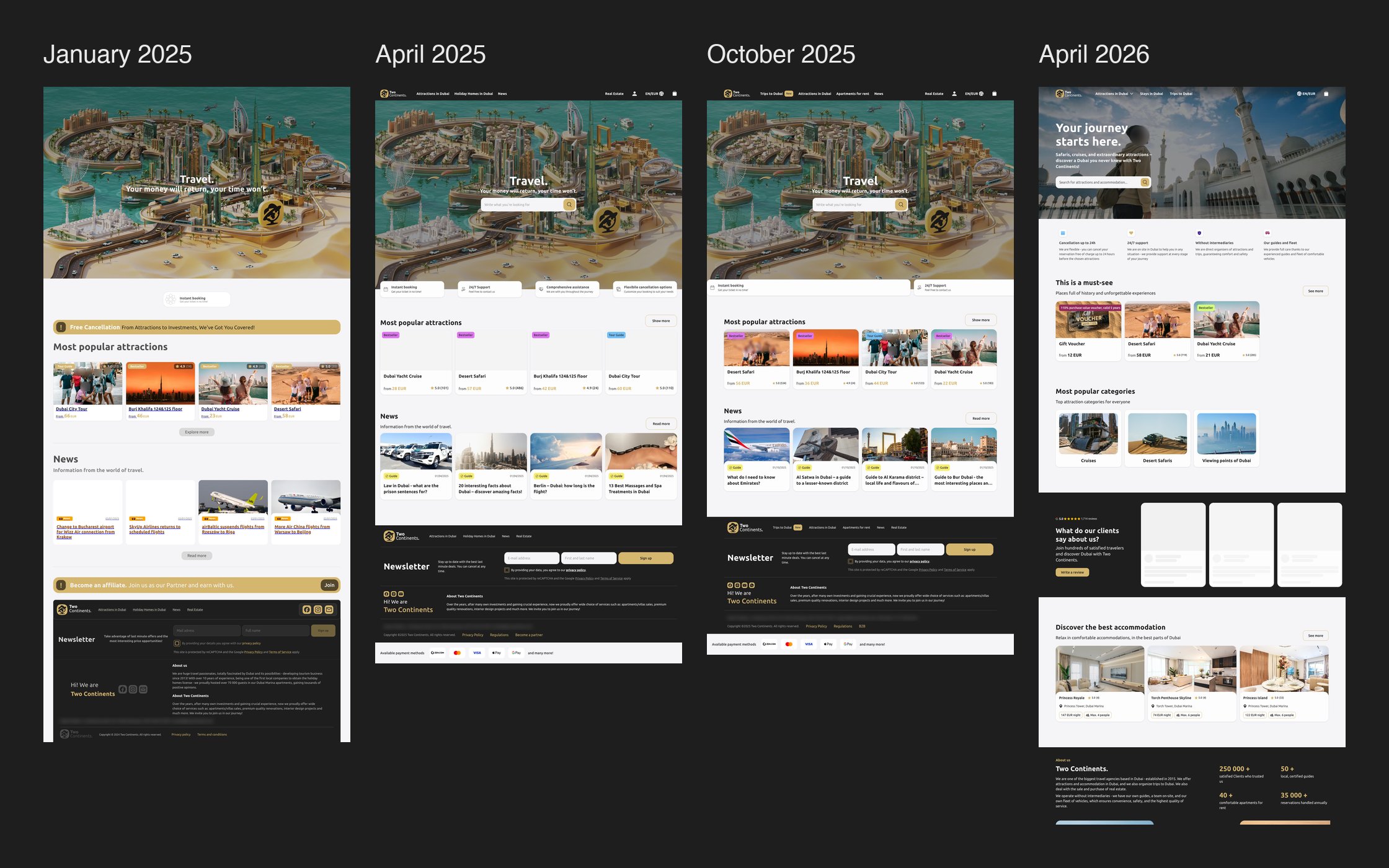
04 · The design system
One-off screens or a system? A custom design system: slower at the start, but design and engineering got one source of truth.
- Built with the developers in atomic design, with 50+ components.
- Custom rather than off the shelf: existing systems didn't match the platform's visual identity or the complexity of its components, and we needed room to scale.
- Structured documentation made the handoff smoother and implementation faster.
05 · New modules on the system
With the system in place, new parts of the website shipped faster and stayed consistent.
- Stays in Dubai: listings with a map, sorting and filters, plus SEO content and an FAQ, in four breakpoints.
- Trips and flight deals: product pages built from the same components.
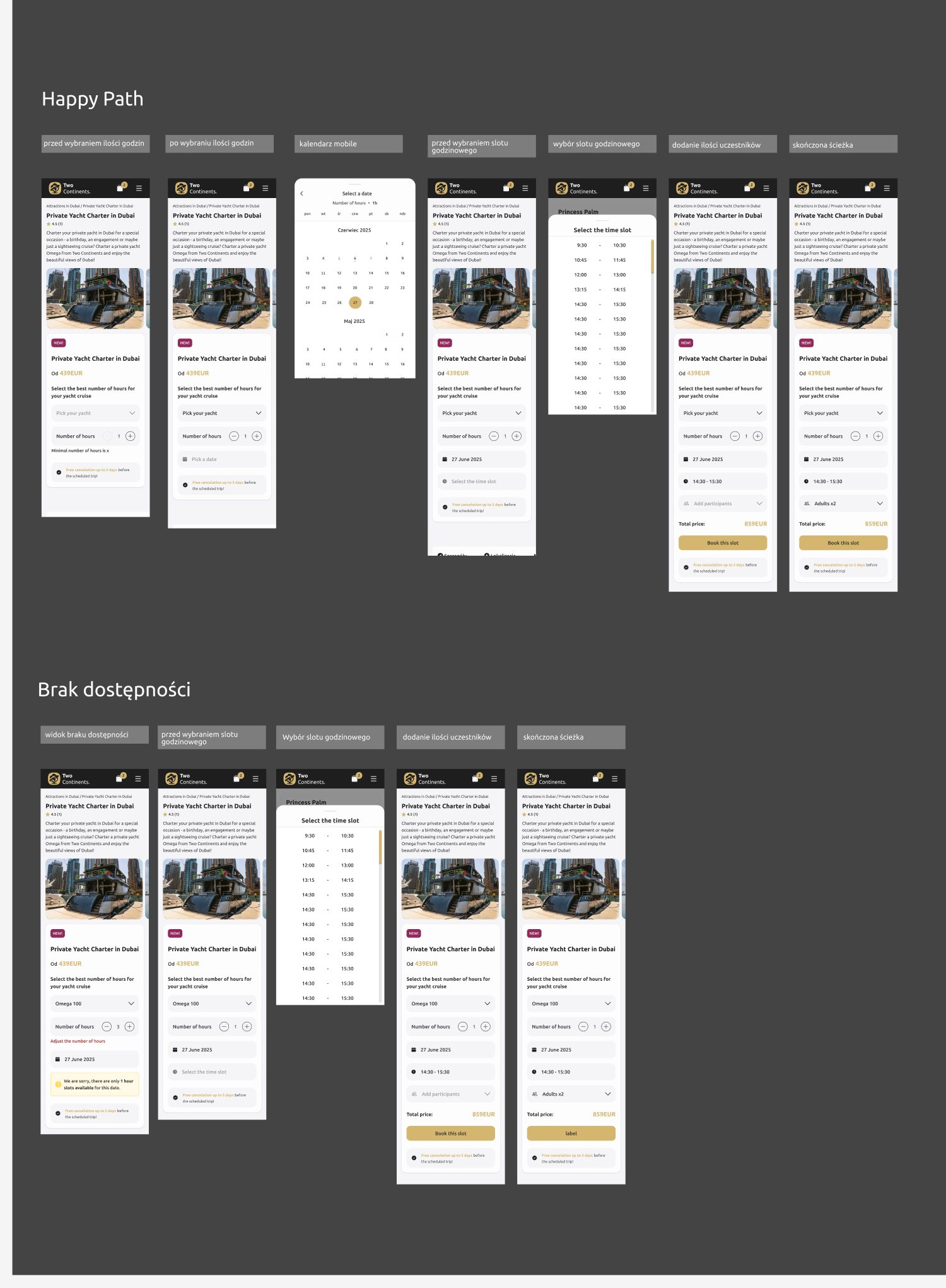
- Yacht cruises: the booking logic for both the happy path and a date that is no longer available.
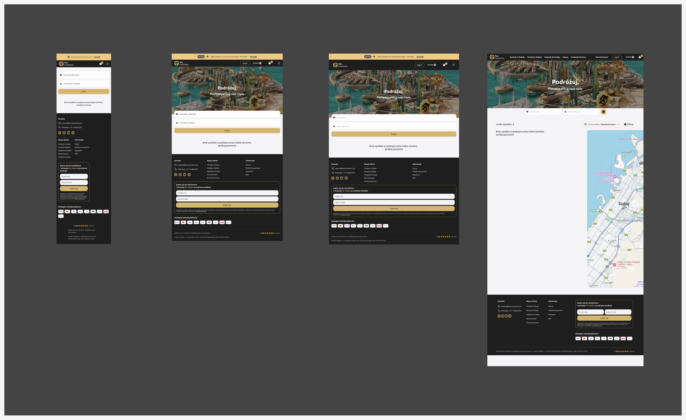
- Edge cases: a zero-results state, and success and payment-retry pages for attractions, stays and organised trips.
- Less back-and-forth with developers, because every new module started from components and guidelines they already knew.
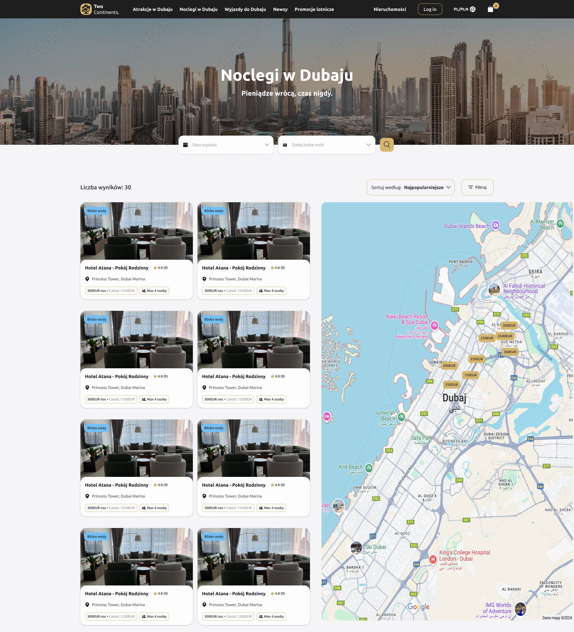
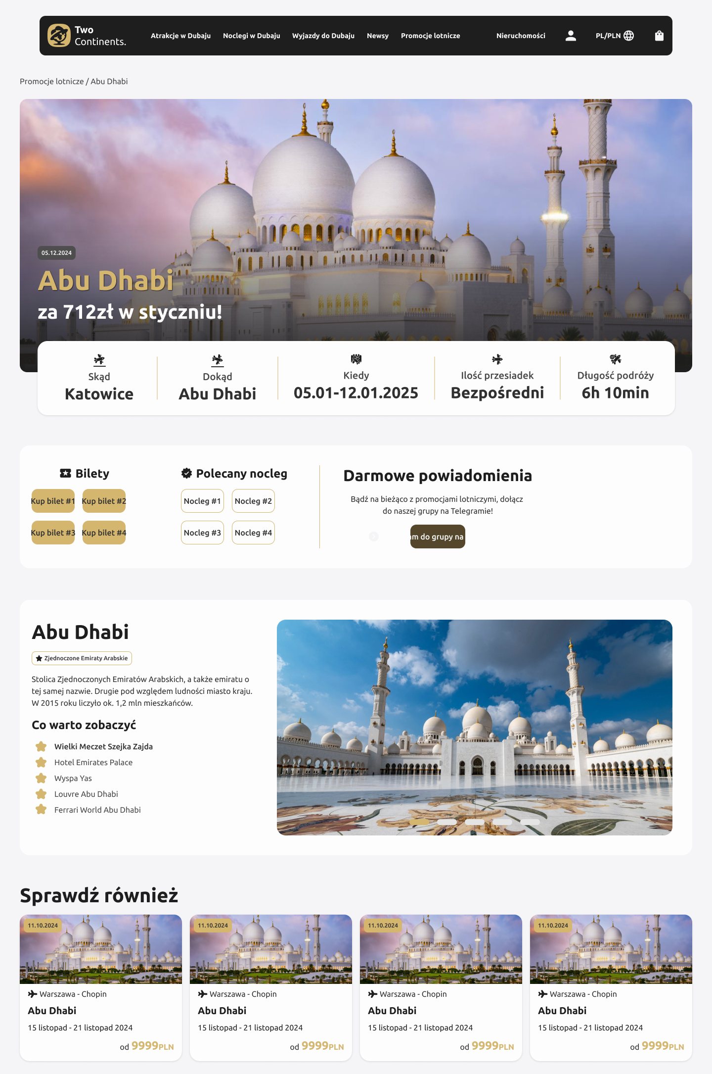
06 · Influence
Research was new at CodeYourBrand, so before the redesign I had to show why it was worth it.
- I showed the stakeholders why it matters to know how, when and what users do on the website, and took the audit to them as business goals and a phased roadmap they could say yes to.
- Implemented screens drifted from the designs, so I proposed a weekly UX/UI review with developers every Friday and turned each one into tasks for the dev team. It caught 40% more issues on dev, before they hit production.
- I ran the company's first roadmapping workshops and added a discovery phase before design work starts.
- For the business, every website project, from new modules to the redesign, was urgent and needed right away. After two hours of the workshop we still couldn't agree on priorities, so we set them in a separate session.
Insights only mattered once they became business goals and a roadmap that stakeholders could say yes to.
07 · Building the design team
After six months as the only designer, I hired a second one and set up how we grow as a team.
- I hired and onboarded Marta, a UX/UI designer, and together we finished the rest of the roadmap.
- I mentored Marta and later Dominika, a junior designer: weekly 1:1s, a skill tree for the team, and growth goals for 3 and 6 months.
- I taught by doing: Marta ran a PostHog survey on the website with my help on the goals, questions and analysis, I onboarded her to Webflow on another client's website, and I mentored two designers through the checkout research.
- A Product Team board in Notion with priorities for the whole team, and a research section I set up with Marta as the base for running studies.
- Marta gained confidence and delivered a big project on her own: the Aesthy.pl website in Webflow.
08 · UI Design

09 · Takeaways & Next Steps
The design system became the base for every new module, from stays to the new checkout, and the weekly reviews with developers caught 40% more issues on dev before production. Implementation matched the designs instead of drifting from them.
Measuring before redesigning saved months: we knew where users dropped off instead of guessing. A design system is never finished; it grows with every module and every test. Next on the list were the checkout flow (see the checkout refactor), search and filters, filters for stays, and fixes from usability tests.