CodeYourBrand · 2026
TwoContinents Checkout refactor
A new purchase path for a Dubai travel e-commerce: an expert audit, in-depth interviews with customers, a prioritised report for the client, and a new cart and checkout designed mobile first.
E-commerce · Checkout · User interviews · UX Audit · Mobile first
- Context
- TwoContinents sells attractions, trips and stays in Dubai. At CodeYourBrand I redesigned how people buy them on the website: the product page, a new cart and a new checkout.
- My role
- Product Designer: expert audit, user interviews and the research report (mentoring two other designers through the study), as-is and to-be user flows, mobile-first UX/UI in four breakpoints and design-system updates.
- The Problem
- Customers couldn't edit their cart, didn't see the final price until they had filled in the whole form, and found attractions with no dates left. On top of that, stays and attractions had separate checkouts, and the checkout raised doubts right at the moment of paying.
- Outcome
- A to-be purchase path designed mobile first in four breakpoints, with every payment state and two add-to-cart variants ready for an A/B test. No business results: my time at CodeYourBrand ended in May 2026, before I could verify them.
01 · The starting point
Before changing anything, I audited the checkout the way a customer meets it.
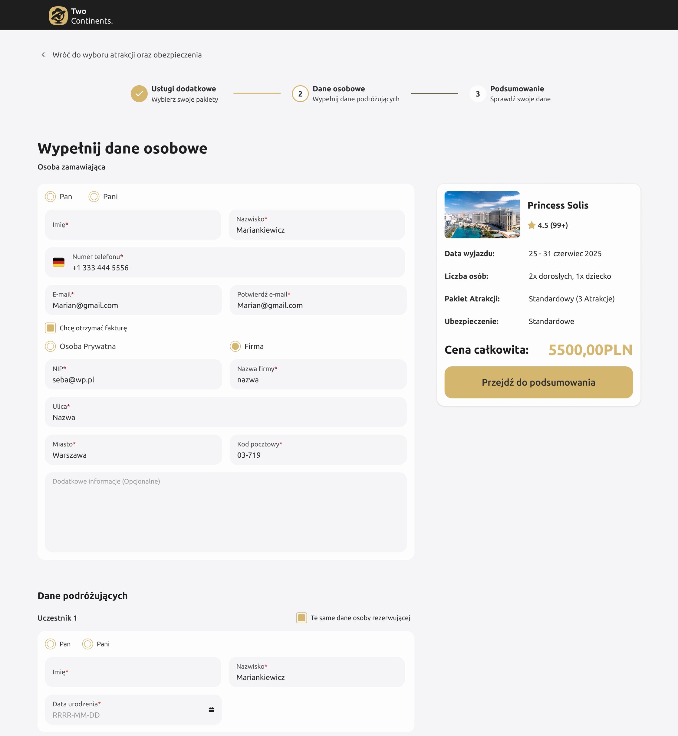
- As-is: stays went through their own three-step checkout (extra services, personal details, summary), separate from attractions.
- Every participant had to fill in a title (Mr/Mrs), name and date of birth, with the full site header and footer around the form.
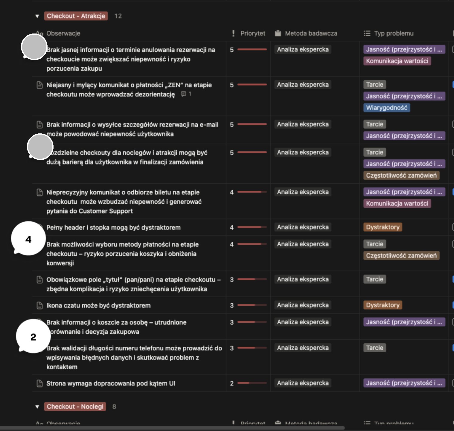
- Expert audit: 12 observations for the attractions checkout and 8 for stays, each with a priority from 1 to 5 and a problem type: clarity, friction, trust, distractions, value communication or order frequency.
- Benchmarks: how Allegro and GetYourGuide handle adding to the cart, cross-selling and holding a spot during checkout.
- Session recordings from Microsoft Clarity backed the changes to the product form.
02 · What the audit found
The biggest problems weren't visual. They were about trust, right at the moment of paying.
- Priority 5: no clear cancellation deadline, a confusing message about paying with ZEN, no word that booking details go out by email, and separate checkouts for stays and attractions.
- Priority 4: an imprecise message about picking up the ticket, which created questions for customer support; the full header and footer as distractions; no choice of payment method.
- Priority 3: a mandatory title field (Mr/Mrs), the chat icon as a distraction, no price per person to compare offers, and no length check on the phone number.
- The checkout could also fail when someone else booked the same spot first. That is frustrating and can put people off buying.
No cancellation deadline, a confusing payment message, no word about the confirmation email. The top of the list was about trust, not looks.
03 · User research
The audit showed what looked wrong. To learn how people actually buy, I ran in-depth interviews with customers.
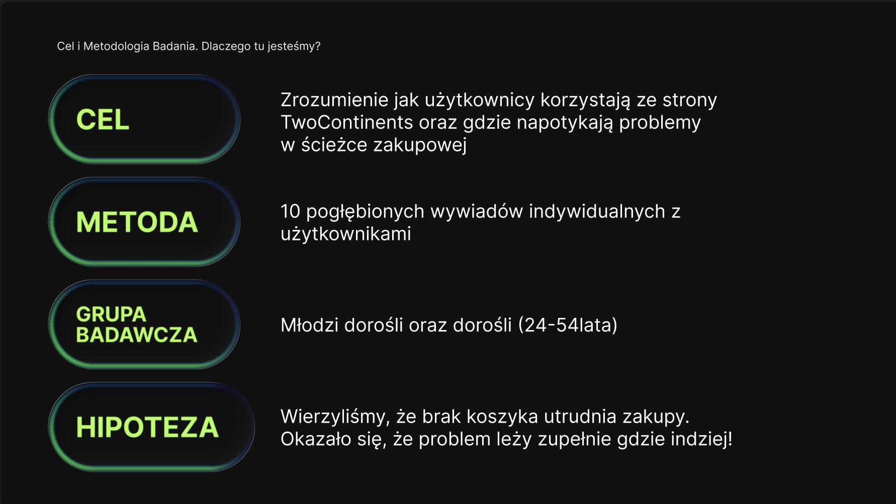
- Goal: understand how users use the TwoContinents website and where they run into problems in the purchase path.
- Method: 5 in-depth 1-on-1 interviews with young adults and adults aged 24–54.
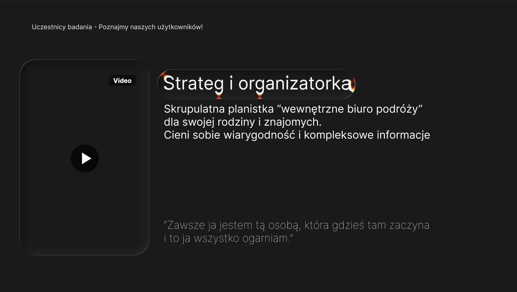
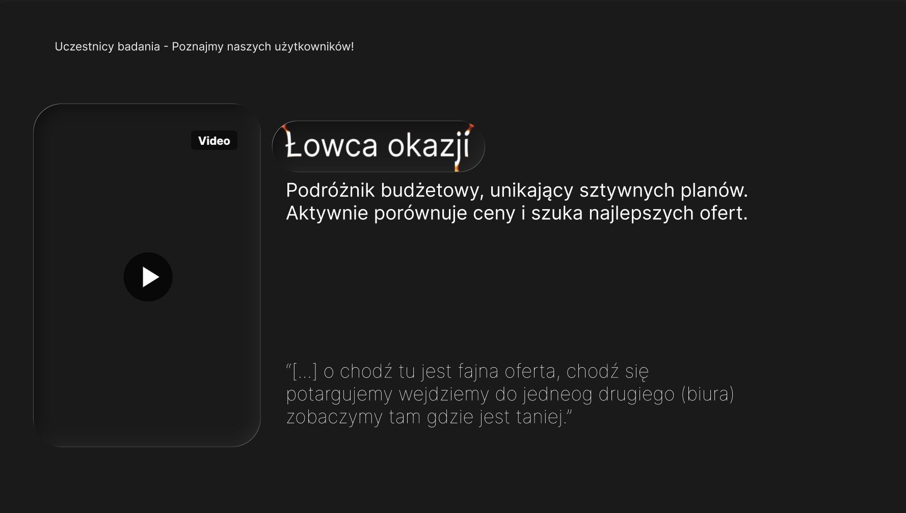
- Two personas came out of it. The strategist and organiser: a meticulous planner, an “in-house travel agency” for family and friends, who values credibility and complete information. The deal hunter: a budget traveller who avoids rigid plans and compares prices everywhere.
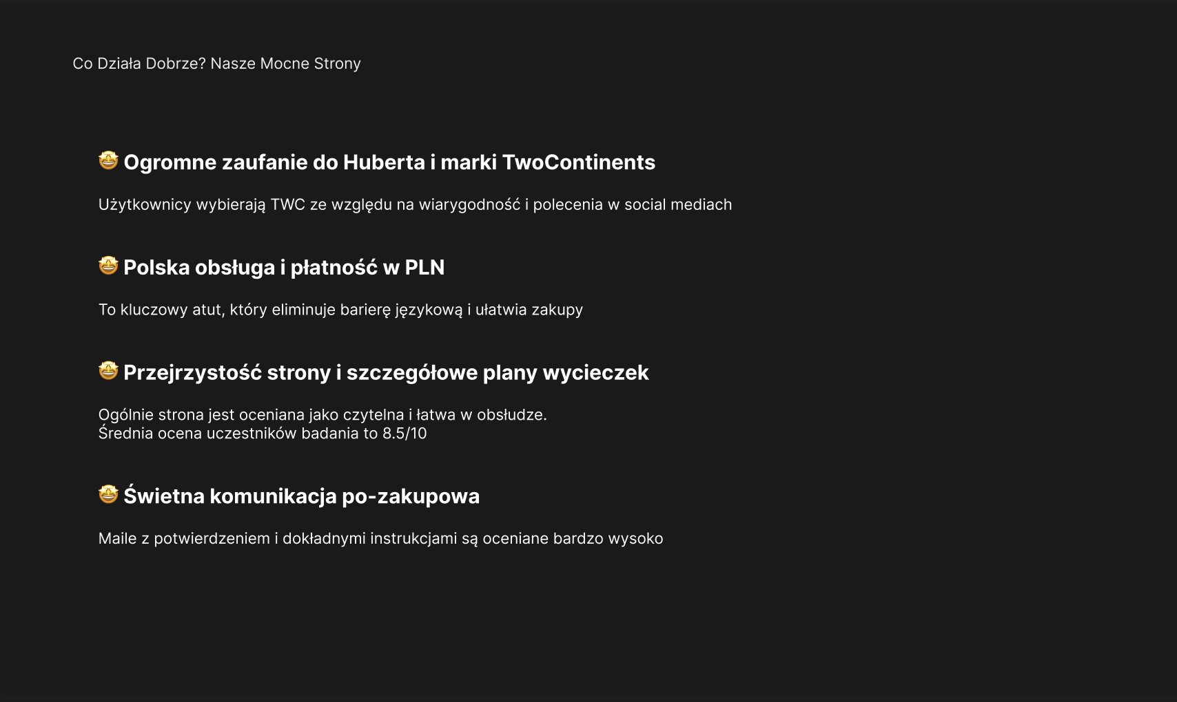
- What already worked: strong trust in the brand and its founder, mostly through recommendations on social media; Polish customer service and paying in PLN; a clear website with detailed tour plans, rated 8.5/10 on average; and confirmation emails with precise instructions.
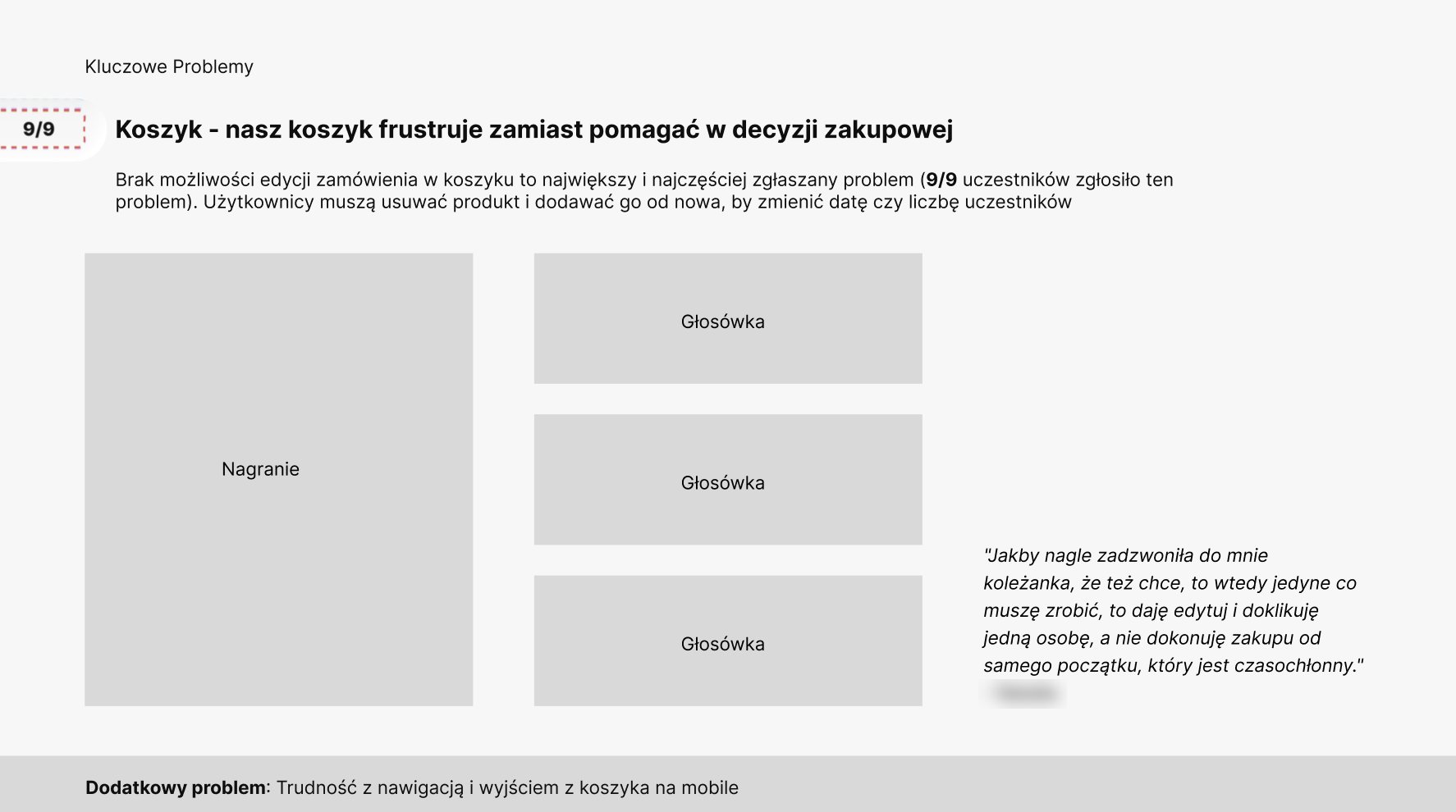
- Problem 1, the cart, raised by every participant: there was no way to edit an order, so changing the date or the number of people meant deleting the attraction and adding it again. On mobile, getting out of the cart was hard too.
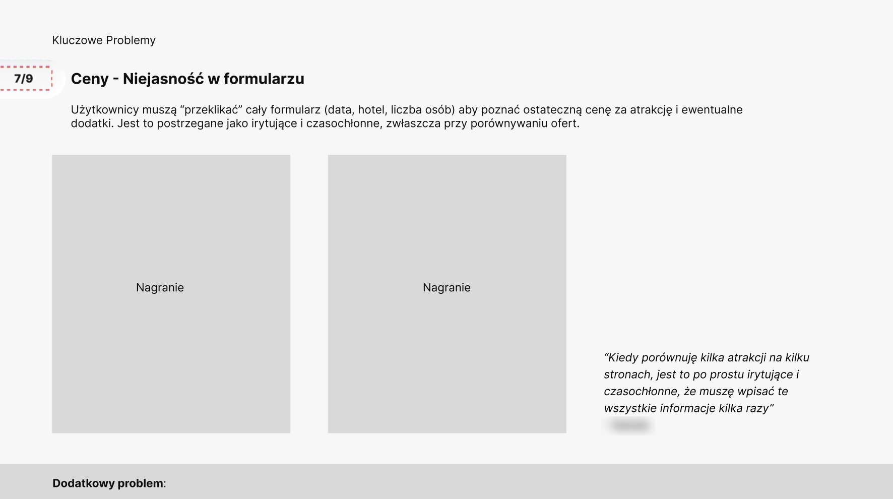
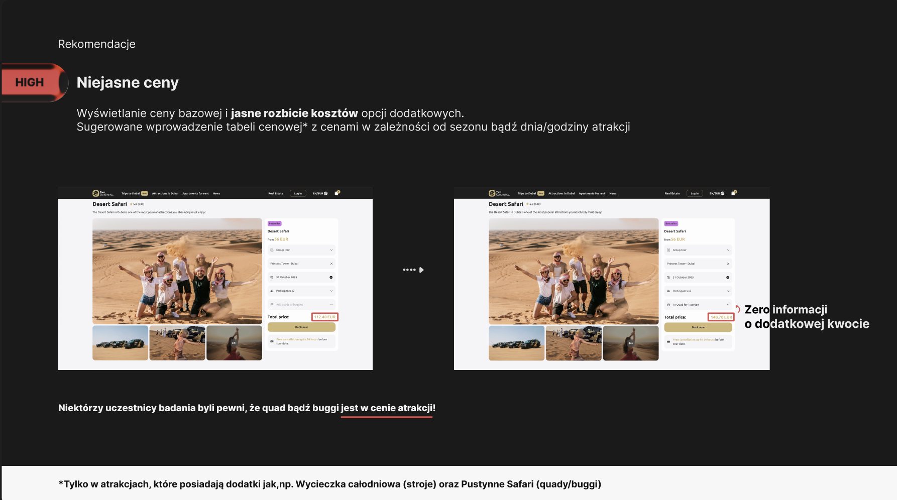
- Problem 2, prices: most participants had to click through the whole form, date, hotel and number of people, before they saw the final price, and some were sure the quad or buggy was included.
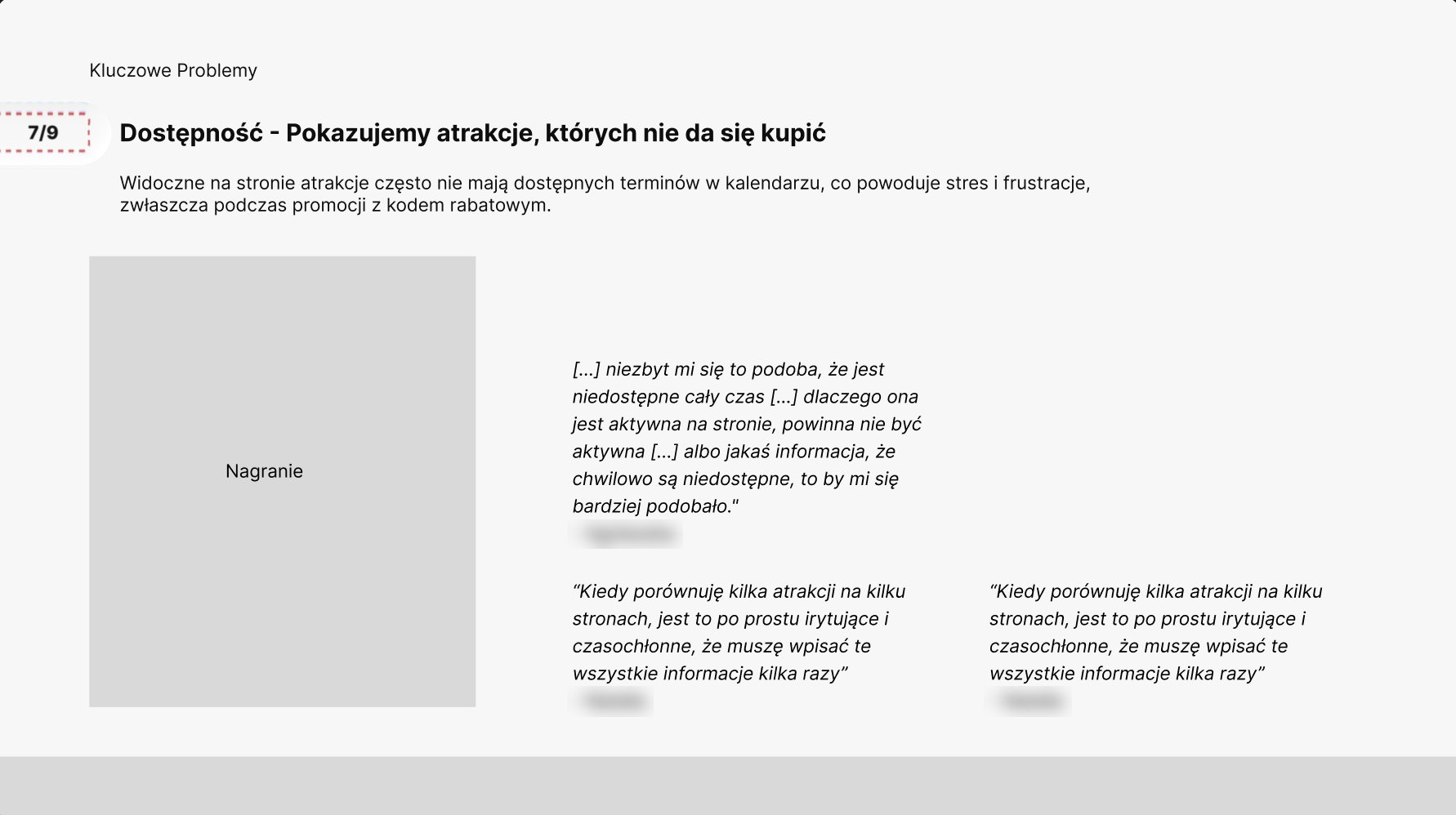
- Problem 3, availability: attractions shown on the website often had no dates left, which caused stress, especially during promotions with a discount code.
We assumed the cart was what made buying hard. It was everything around it: an order you couldn't edit, the price shown only at the end, and dates that weren't available.
04 · Report and recommendations
I turned the findings into a report and a presentation for the client, with a priority on every recommendation.
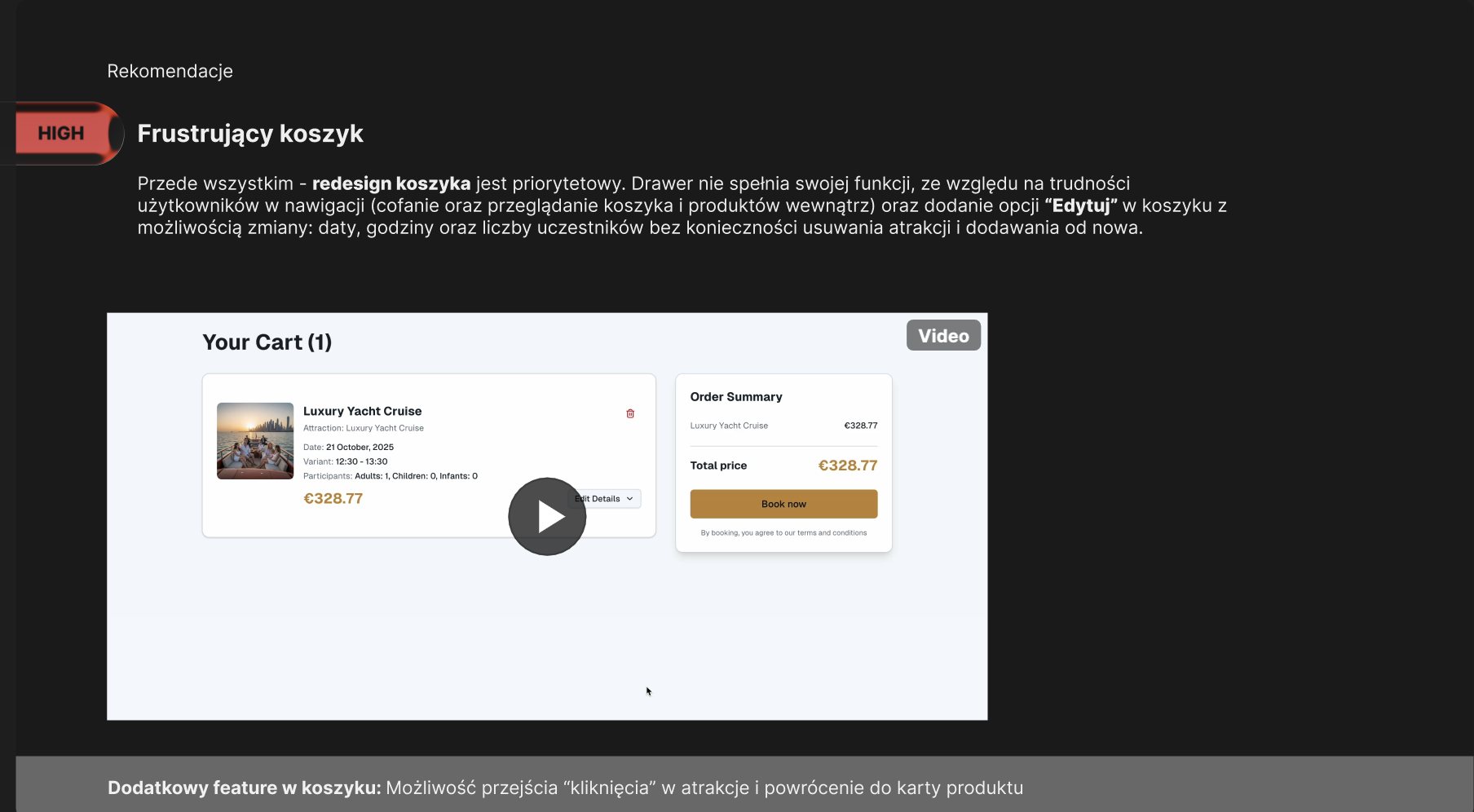
- High: redesign the cart. The drawer didn't do its job, so the cart needed easier navigation and an Edit option for the date, time and number of participants, plus a way to click an attraction and go back to its product page.
- High: clear prices. Show the base price and a breakdown of add-on costs, with a price table by season, day or time for attractions that have add-ons, like the desert safari (quads and buggies) or the full-day trip (costumes).
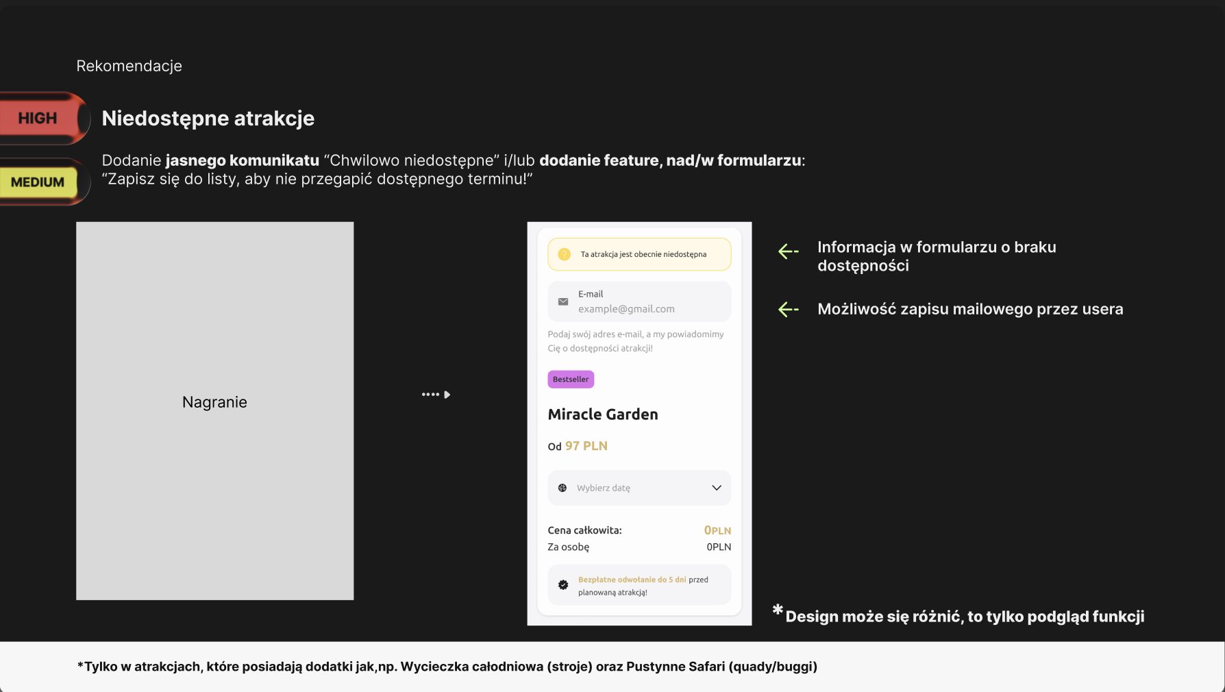
- High to medium: unavailable attractions. A clear “temporarily unavailable” message in the form, and a sign-up to get an email when a date opens.
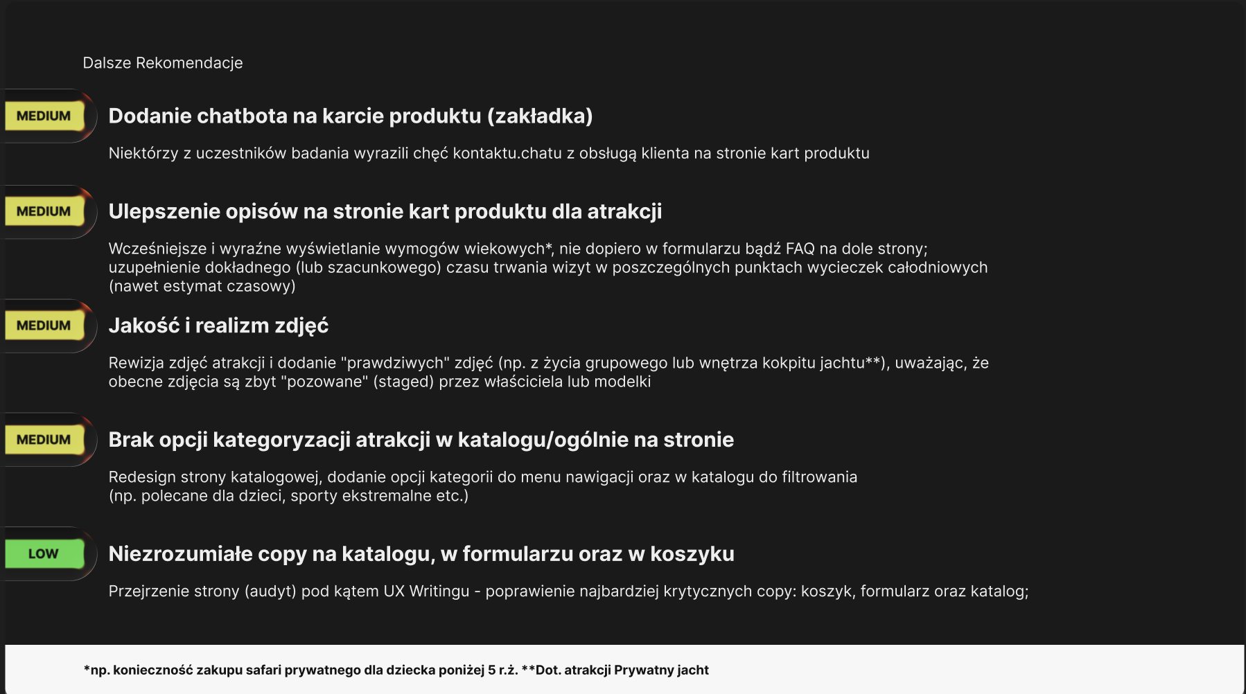
- Medium: a chat on the product page, age requirements shown earlier, time estimates for each stop of a full-day trip, more real and less staged photos, and categories and filters in the catalogue. Low: a UX writing review of the catalogue, the form and the cart.
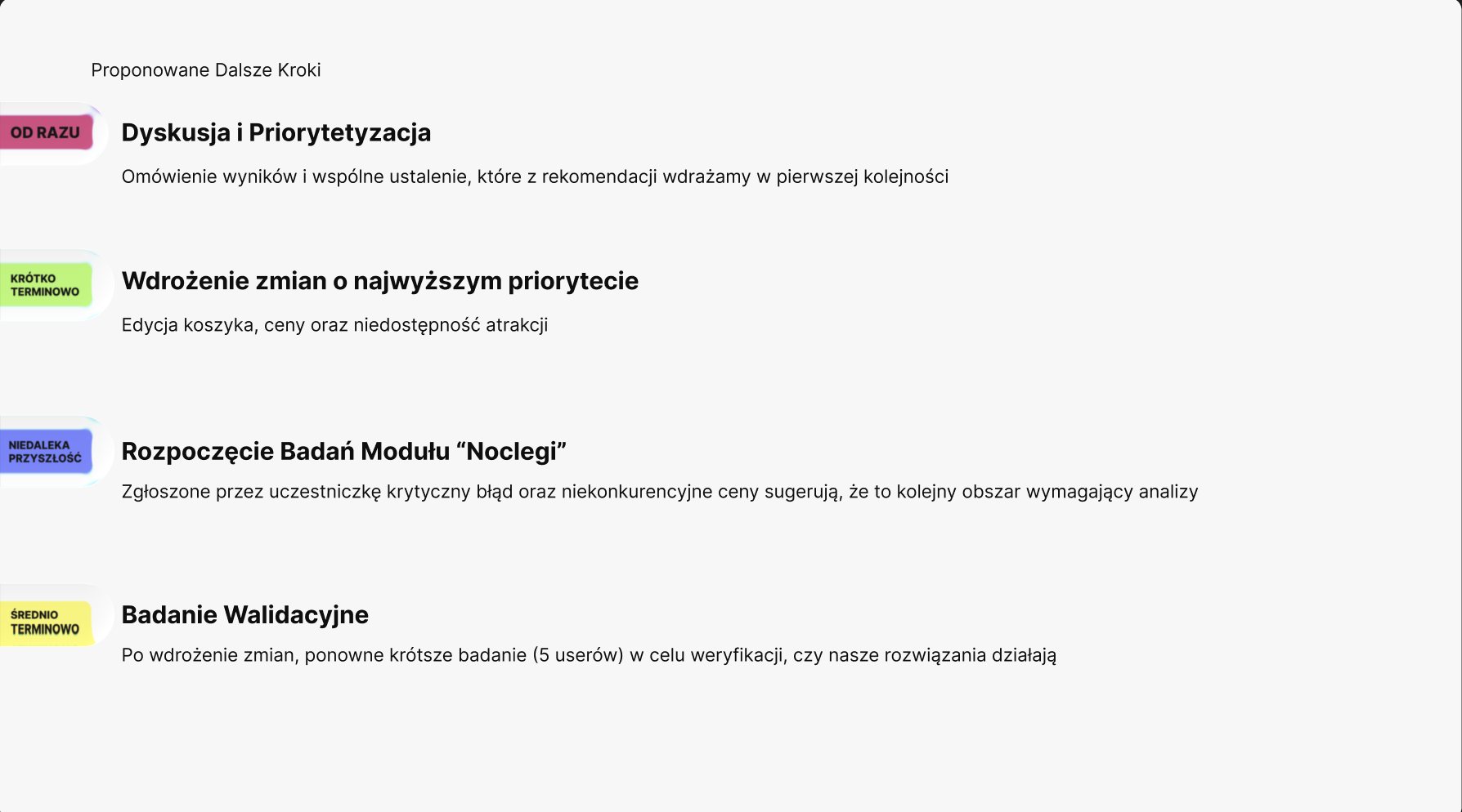
- Next steps I proposed: agree on priorities together right away, ship the cart editing, prices and availability fixes first, research the stays module next, after a participant reported a critical bug and uncompetitive prices there, and run a shorter validation study with 5 users once the changes are live.
Result: the high-priority items became the starting point for the new purchase path below.
“If a friend suddenly called to say she wants to come too, I'd just hit edit and add one person, instead of starting the whole time-consuming purchase over.”
05 · Influence
The research changed the plan, and the priorities made it easy for the client to say yes.
- We started with a hypothesis about the cart. When the interviews pointed to editing, prices and availability, I changed the plan and showed the client why, in the participants' own words.
- A priority on every recommendation turned a long list into an order of work the client could agree to: cart editing, prices and availability first.
- I led the study and mentored two other designers through it: the plan, the interviews, the synthesis and the report.
- The whole team was impressed by the amount of work behind the study, and the client left feeling looked after, with a clear plan.
06 · From as-is to to-be
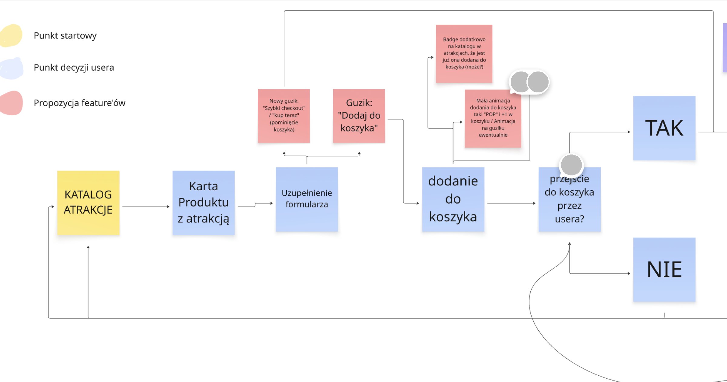
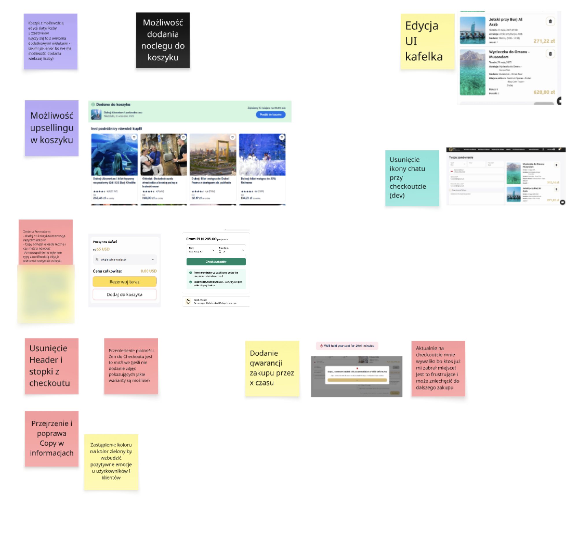
I mapped the purchase path on one board: every step, every decision the user makes, and where a new feature could help.
- The path: attraction catalogue, product page, filling in the form, adding to the cart, then the user's decision: go to the cart, or go back to the catalogue and keep shopping.
- Feature proposals on the flow: an Add to cart button, a Quick checkout / Buy now button that skips the cart, a badge in the catalogue for attractions already in the cart, and a small pop animation when something is added.
- Proposals from the audit and benchmarks: editing the date and number of participants in the cart, upselling in the cart, adding a stay to the same cart, holding the spot for a set time, and removing the header, footer and chat from checkout.
- Smaller fixes: reviewing the copy in the information blocks and moving the ZEN payment into the checkout.
07 · Mobile first: the new path
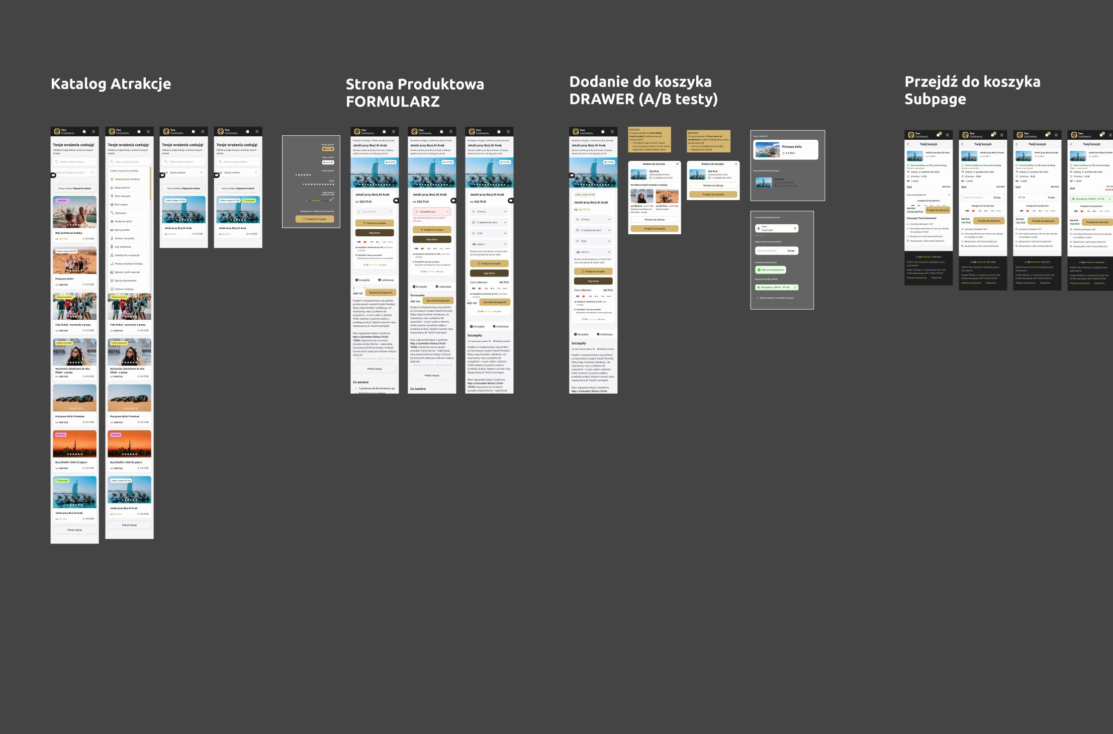
I designed the whole path on a 320 px screen first: catalogue, product page, add to cart, cart, checkout, loading and order summary.
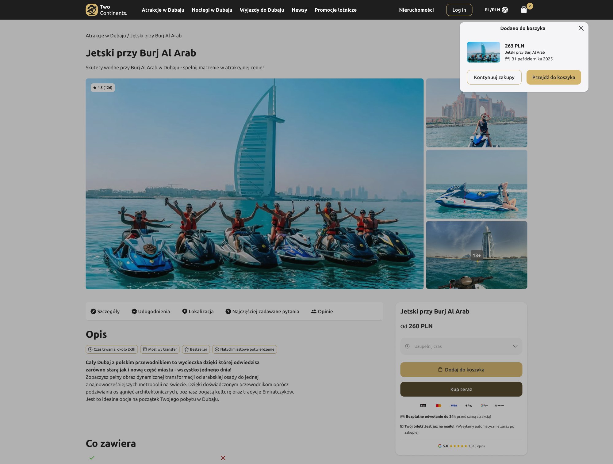
- Product page: the form for date and participants, with Add to cart and Buy now side by side, and the cancellation terms and payment methods visible before the click.
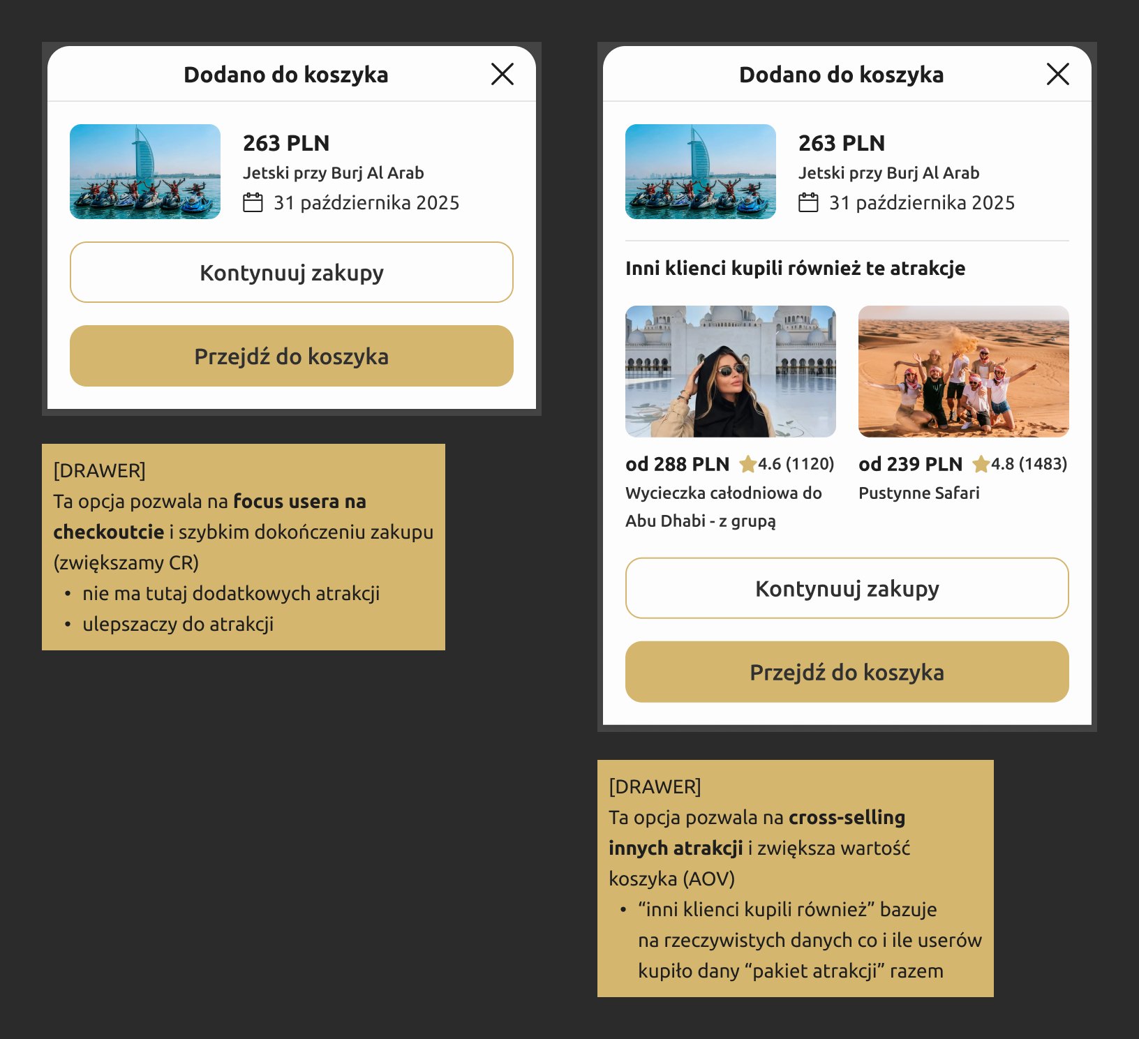
- Adding to the cart opens a drawer, in two variants for an A/B test. Focus: no extra attractions or upgrades, so people finish the purchase (conversion rate). Cross-selling: “other customers also bought”, based on real data about which attractions people bought together (order value).
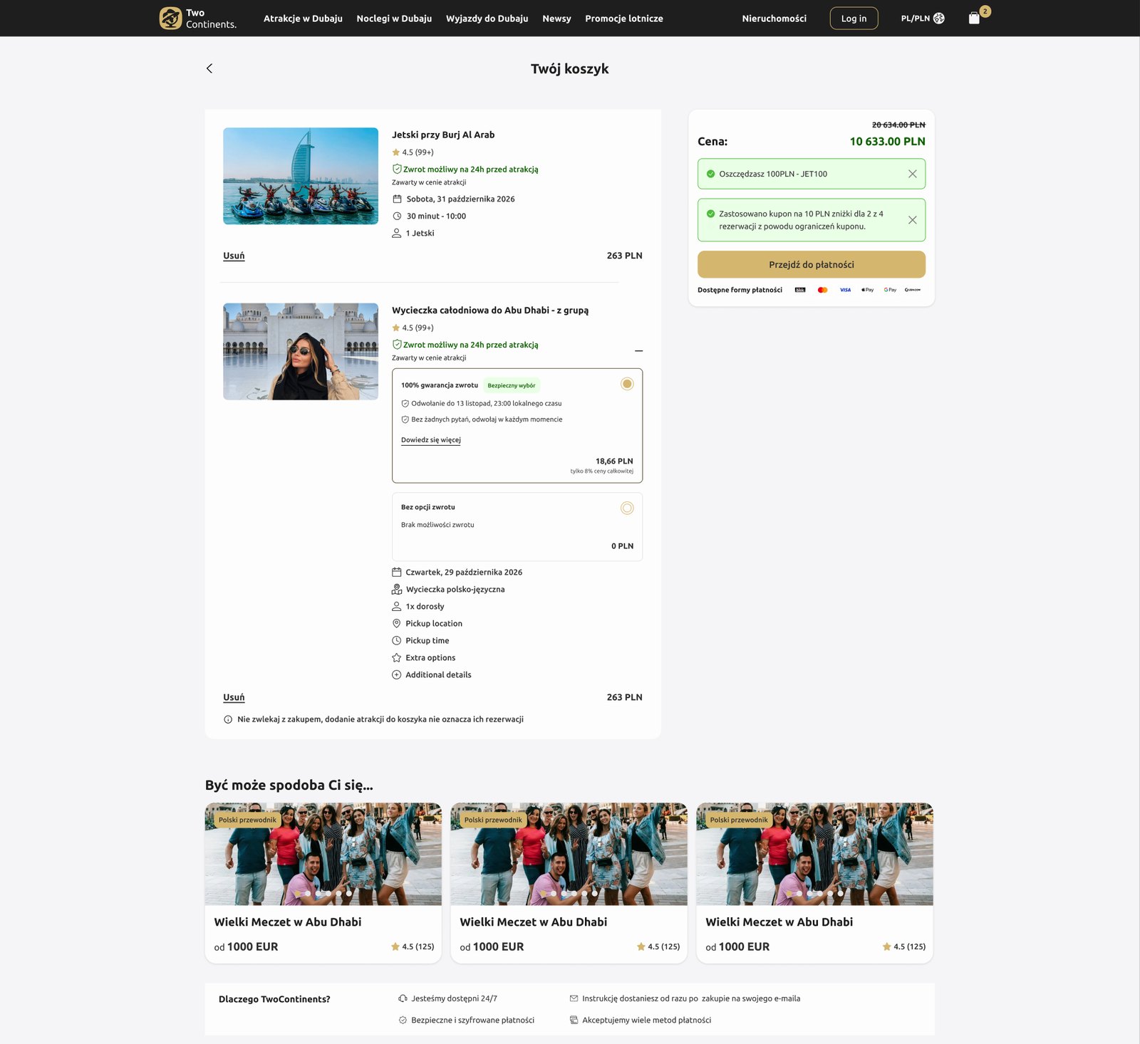
- A new cart subpage: each attraction with its date, time and participants, the refund rule (up to 24 h before), an optional 100% refund guarantee, discount codes, and a note that adding to the cart doesn't reserve the spot.
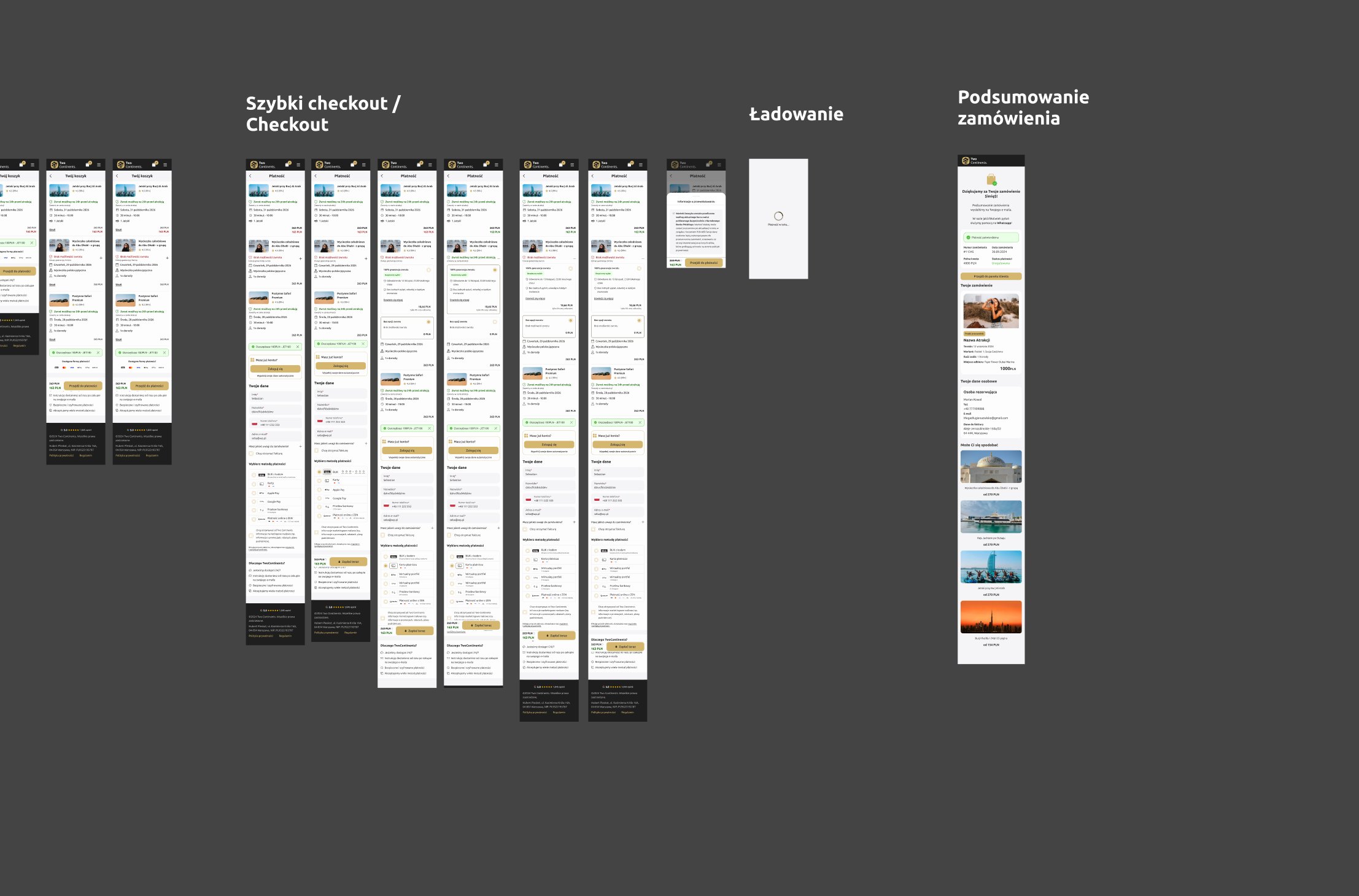
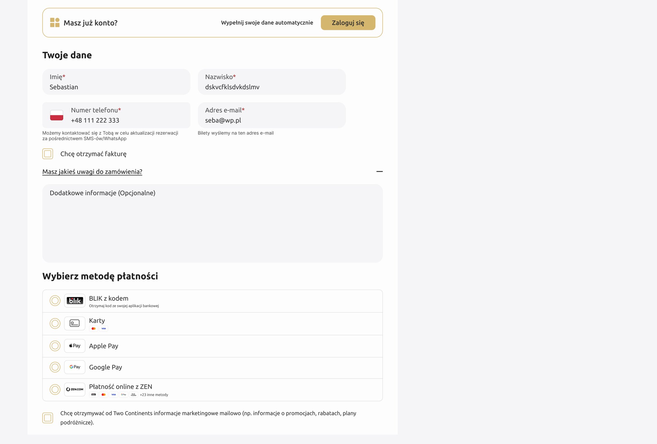
- A new checkout without the full header and footer: one form without the title field, autofill for people with an account, and a choice of BLIK, card, Apple Pay, Google Pay or ZEN.
Two drawers, two goals: one to finish the purchase, one to grow the order.
08 · Every state, every breakpoint
A checkout breaks in its edge cases, so I designed them all.
- Four breakpoints for the product page, cart and checkout: Base 320–587, SM 588–999, MD 1000–1439 and LG 1440–1999 px.
- Cart and checkout states: one attraction, two attractions, an empty cart and an empty checkout.
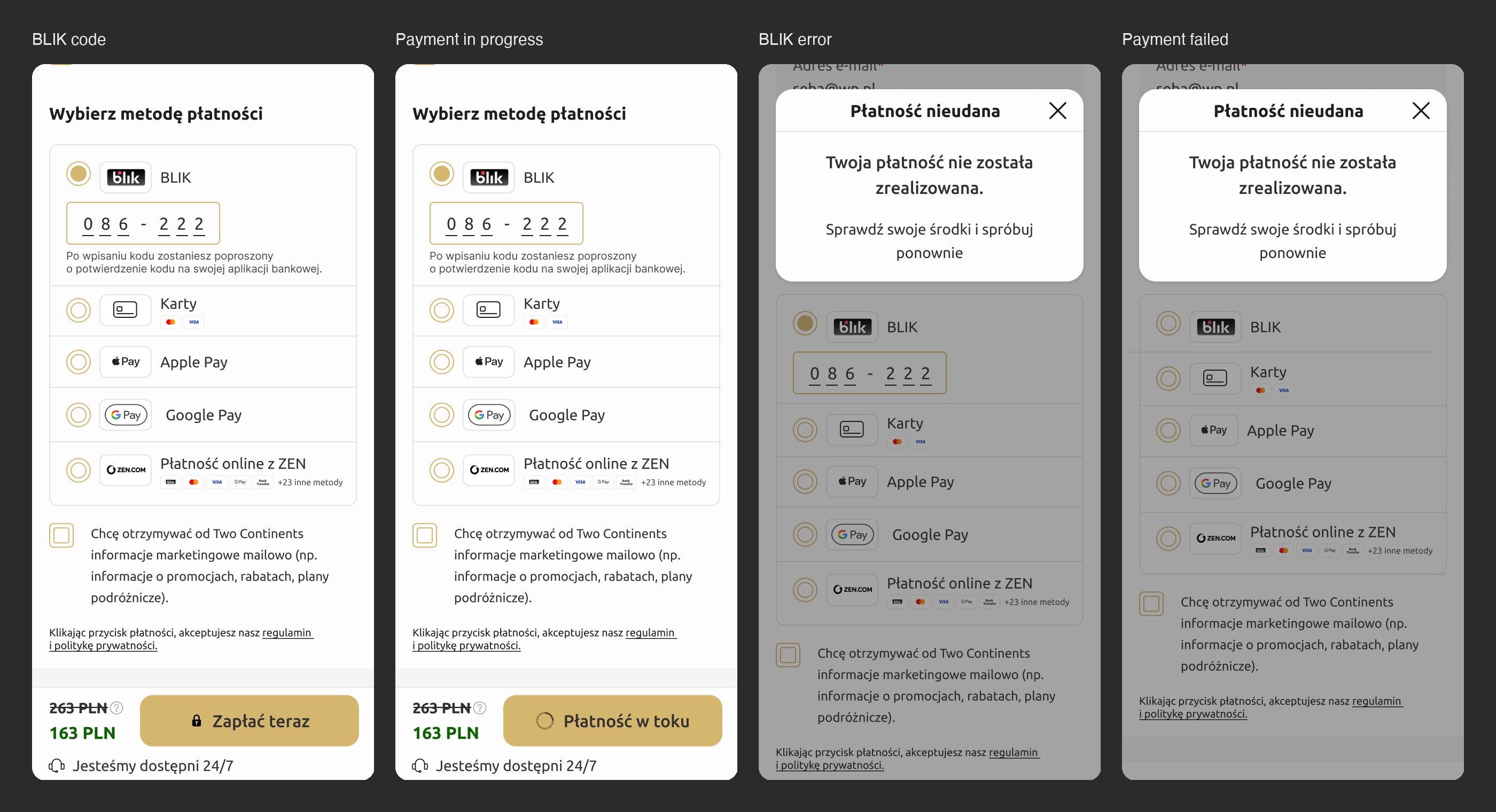
- Seven payment states on mobile and desktop: empty, selected, typing the BLIK code, the BLIK modal, a BLIK error, a failed Google Pay or Apple Pay payment, and loading.
- Discount code messages: an invalid code, a minimum order value, an expired code, and a coupon that applies to only some of the reservations.
- Design system updates for the path: new button sizes, a 10 px type style, a 40 px extra-small field, a message with a ghost button, and missing icons flagged for Storybook.
09 · Takeaways & Next Steps
No results to show. My time at CodeYourBrand ended in May 2026, so I couldn't verify the business metrics this work was meant to move: conversion rate and average order value.
Our own hypothesis was wrong: we thought the cart was the problem, and the interviews pointed to editing the order, prices and availability instead. Next, I would run the validation study with 5 users and the A/B test of the two drawers, and bring stays into the same cart.