GOG.com · CD PROJEKT Group · 2024
GOG.com Marketing email system
Turning a patchwork of marketing emails into one system for a global game store: a mascot, reusable blocks and game-themed exclusives, validated in A/B tests with +12% CTR and −10% unsubscribes.
Email design · Design system · A/B testing · Localisation

- Context
- GOG is a global, DRM-free game store from CD PROJEKT Group. Its marketing emails reach a huge audience and are one of the store's main revenue channels.
- My role
- Product Designer in a team of two designers and two people from marketing. The lead product designer set the direction and the core components; I designed emails from the system, including the game-themed exclusives and their language versions, and contest landing pages.
- The Problem
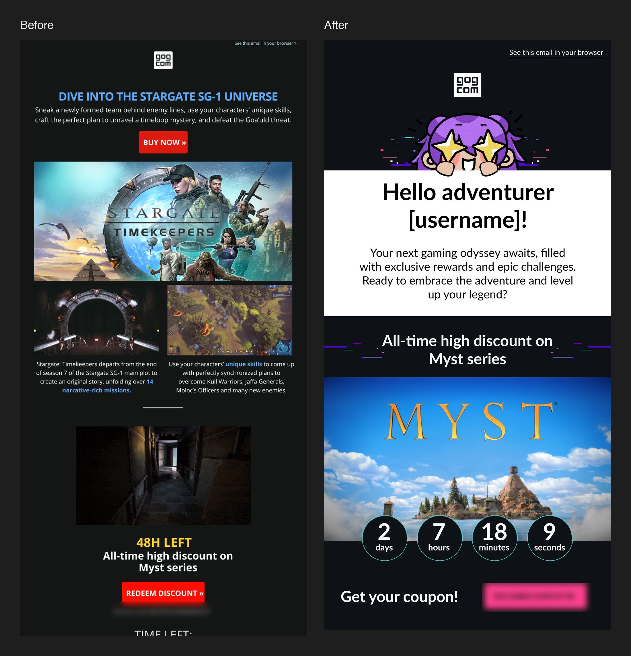
- The emails had turned into a jumble of banners, fonts and CTAs: inconsistent typography, unbranded buttons, low contrast and no personalisation. Regular campaigns looked generic and underperformed.
- Outcome
- A modular email system with a mascot, reusable blocks and templates for each type of email. In A/B tests: +12% CTR on regular newsletters and −10% unsubscribes, plus about 5% more gross revenue and roughly 40% less time to build an email.
01 · What was unclear
The emails reached a huge audience but underperformed, and nobody had looked at them as one product.
- A review of 10 recent campaigns found 7 different CTA button styles and inconsistent header branding, while competitors' emails were consistent.
- Typography changed from email to email, buttons weren't branded, some elements had low contrast, and nothing was personalised.
- Dark sections on a dark background hid the CTAs in some mail clients.
- Constraint: SalesManago, the marketing team's drag-and-drop tool, had simple features, and anything custom needed code.
02 · Research
Past A/B tests already held the answer: one clear offer beats a crowded email.
- Marketing's past A/B data: emails with a single, clear offer above the fold had a 15% higher CTR than those with several cluttered messages.
- A teardown of how other gaming and e-commerce stores design their emails.
- An internal review of GOG's own emails against brand standards and good UX.
- The live emails were imported from SalesManago into Figma, so we could audit and redesign them side by side.
Two seconds to see if there's a deal I care about.
03 · The system
Three rules shaped every email: a consistent look, the mascot as a friend, and CTAs you can't miss.
- Rules for layouts, fonts, colours and images, and templates for each type of email.
- GOG-chan, the store's mascot, in the header with a personal greeting (“Hello adventurer [username]!”) on a white background, so the email catches the eye in a dark inbox.
- Reusable content blocks, each with one message and one clear CTA, so marketing assembles an email instead of designing it from scratch.
- Short, direct copy and bolder buttons: early versions had CTAs that were too quiet, and A/B tests showed that bolder ones performed much better.
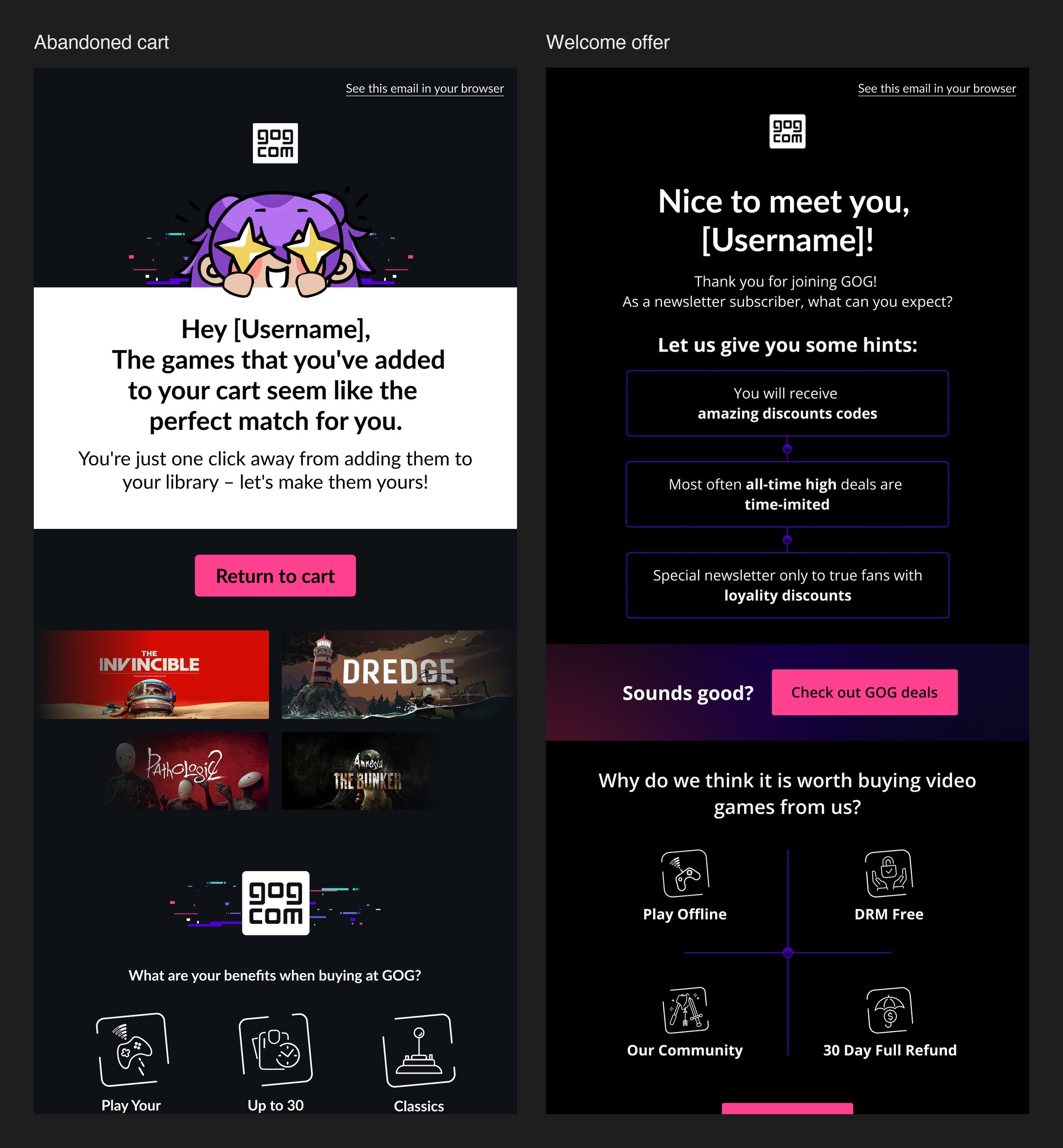
- The same closing block in every email about what buying on GOG means: play offline, refunds of up to 30 days, classics preserved.
04 · Exclusive emails
Exclusive offers got their own design, built around one game and its atmosphere.
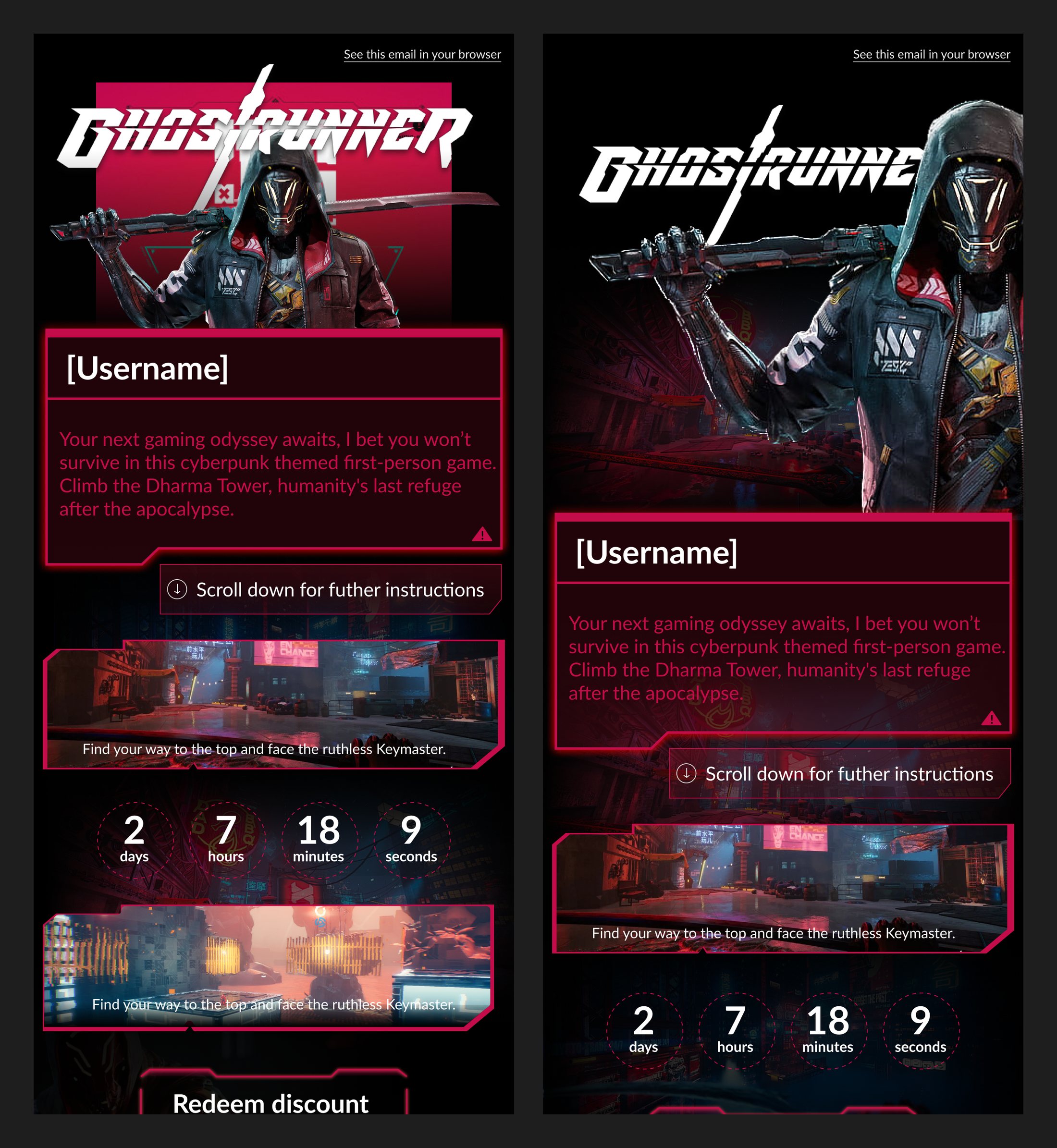
- I designed the exclusive emails: each one takes on the visual language of its game, like the cyberpunk interface of Ghostrunner.
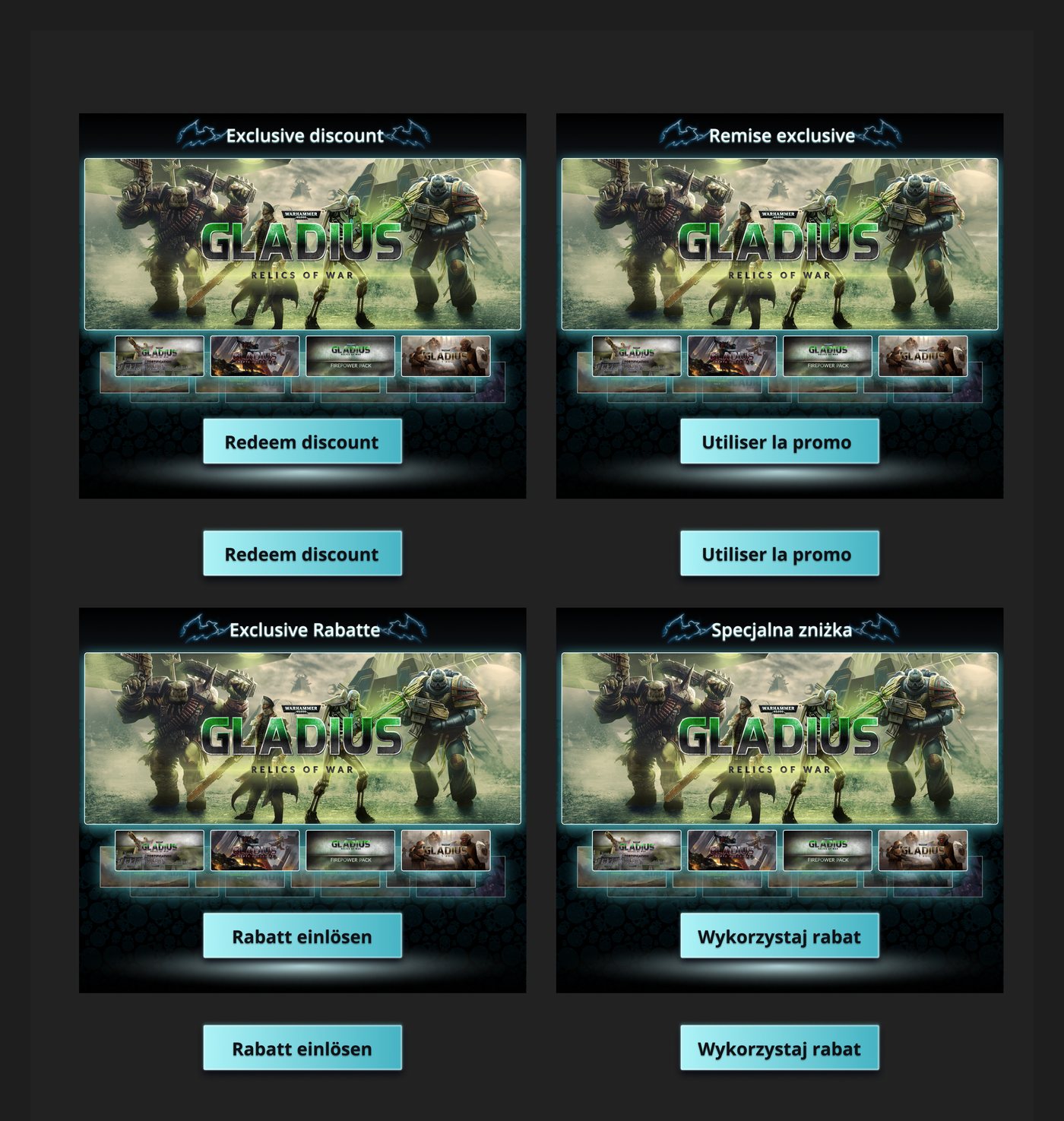
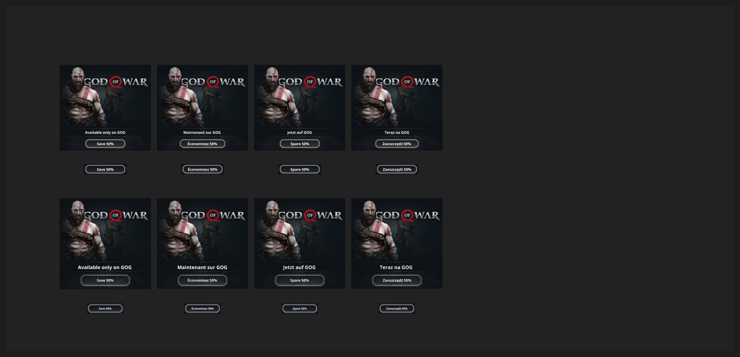
- The same approach carried over to exclusives for God of War, Alpha Protocol, Warhammer 40,000, Stellaris and Master of Magic.
- Language versions in English, French, German and Polish, with the copy and buttons adapted for each market.
- Contest landing pages, like The Thaumaturge RPG giveaway, brought a game's dark, narrative tone into the UI itself.
05 · One system, many jobs
The same blocks had to carry lifecycle emails and campaigns with very different goals.
- Lifecycle emails: after a product view, an abandoned cart, after a purchase, and a welcome offer with a reminder for new subscribers.
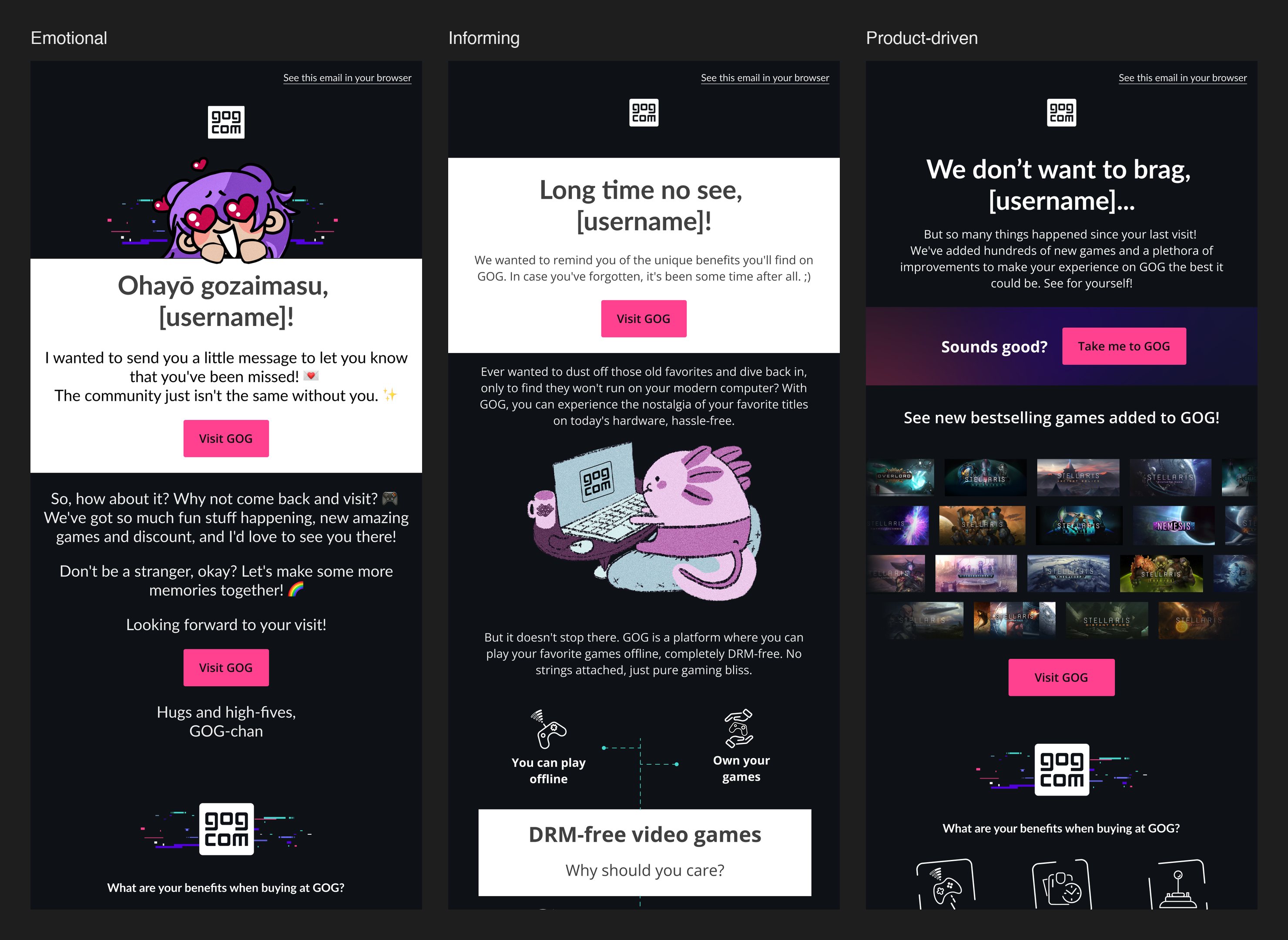
- Campaigns in three tones, three of each: emotional (GOG-chan writing to people who drifted away), informing, and product-driven (new games and bestsellers).
06 · How we validated
A/B tests decided, not taste.
- Marketing ran the A/B tests with us, and we tracked open rate, CTR and unsubscribes.
- Two calls a week with marketing and an always-on Slack thread for quick feedback.
- Because of the A/B tests, the +12% CTR is a measured result, not a self-reported one.
07 · Takeaways & Next Steps
+12% CTR on regular newsletters compared with the old design and −10% unsubscribes, both from A/B tests. The redesigned emails contributed to about a 5% lift in gross revenue, and marketing now builds a new email in roughly 40% less time.
My first full product cycle: discovery, design, A/B validation and a measured rollout. What stayed with me was the testing habit: once A/B results became the argument, design decisions stopped being a matter of taste. Next time, I would also talk to subscribers before designing, not only study test data and best practices.