2025–2026
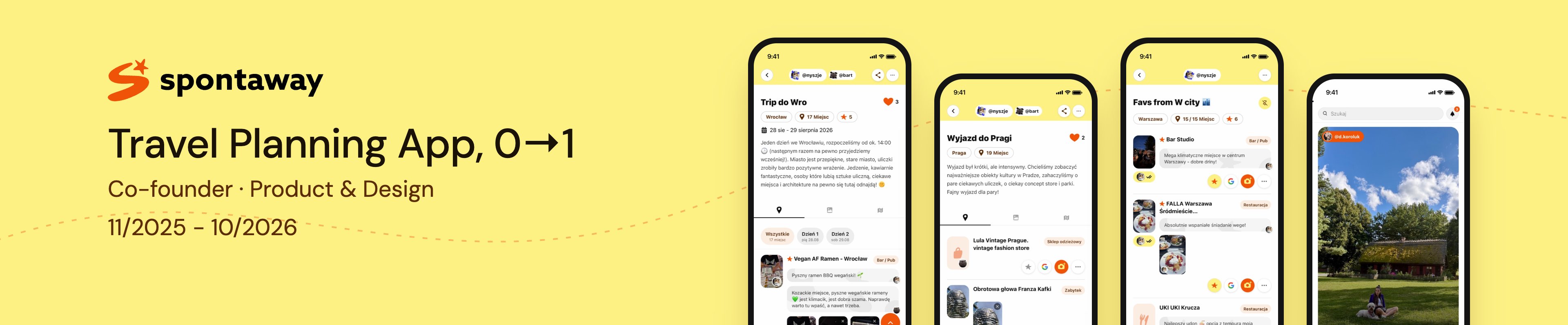
spontaway Travel Planning App
Co-founded a travel-planning app and took it from first idea to App Store submission in 11 months: research in waves, four product cores, and a build I did myself with AI.
0→1 Product · UX Research · B2C + B2B · Design System · iOS · AI-assisted build
- Context
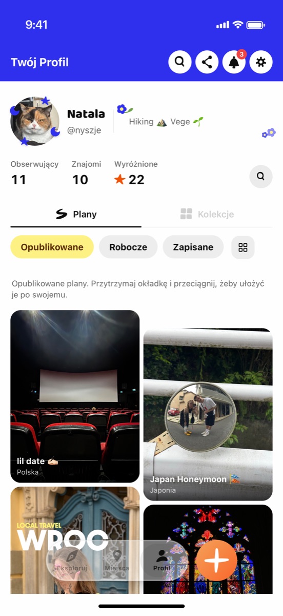
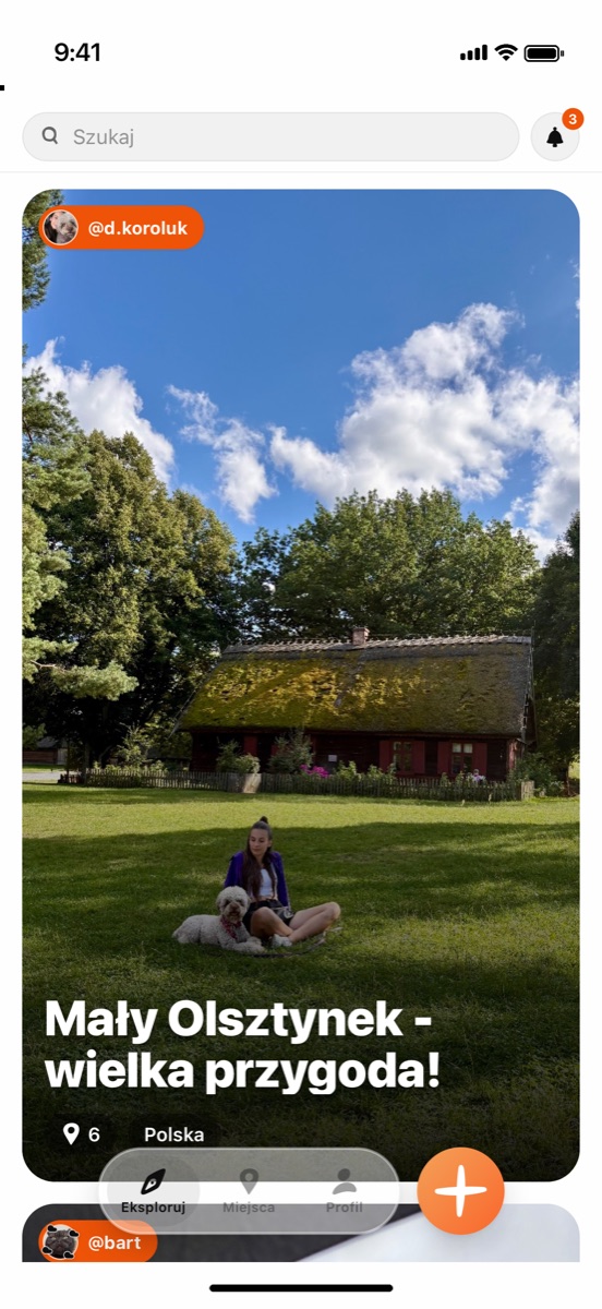
- spontaway is a travel-planning app: people collect places, plan trips solo or with friends, and leave notes for other travellers instead of star ratings. Local venues run their own profiles in a B2B panel.
- My role
- Co-founder, product and design: research, UX/UI, brand, design system, copy and analytics. I also built the product myself with AI (Claude Code). Bartosz and Maciej covered business, finance and venue acquisition.
- The Problem
- Planning a city break means juggling Maps pins, Instagram saves and friends' tips, and small venues can't reach visitors from out of town. The hard part was finding a version people would use, with no budget and an empty place database.
- Outcome
- Four product cores in 11 months, then App Store submission in October 2026. Closed beta: about 30 people outside the team, 43 plans, 22 collections and 7 venue profiles.
01 · Finding the core
We knew the problem. We didn't know which product would solve it.
- Four cores in 11 months: a social trip journal, an AI voice planner, a “speed dating with the city” card game with group matching, and finally plans and collections recommended by real people.
- Group matching broke in field tests, and the AI planner added cost without adding trust, so we switched both off.
- Two sides of the market, travellers and venues, with one rule: money never buys ranking, because trust is the main differentiator.
- Constraints from day one: App Store guidelines, GDPR and DSA, battery life, and API costs that grow with searches, not with users.
02 · Research
I wrote the success thresholds before the interviews, so we couldn't explain results away afterwards.
- Thresholds: the Sean Ellis PMF question, a discovery hit and a voluntary return. Sample sizes based on Nielsen & Landauer and Guest et al.
- Research in waves: hallway tests (Dec 2025), seven paired usability sessions on TestFlight (Jun 2026), a field pilot where two users planned a real trip (Jul 2026), seven conversations with venue owners and 155 competitor App Store reviews.
- Confirmed: time saving and “everything in one place” (2 of 2 pilot users).
- Surprise: both called it “Tinder for the city”, which collided with our own ban on swipe and match language.
- Venues pay for effect, not tools: 100–200 PLN a month only with visible ROI, and 5 of 7 named done-for-you onboarding as a condition of buying.
“Tinder for the city.”
03 · Options and decisions
Most of the important decisions removed something.
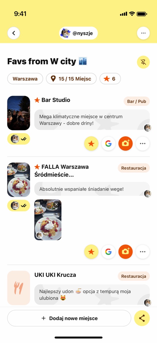
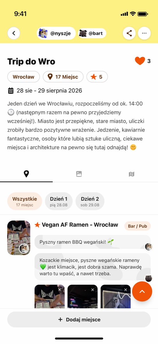
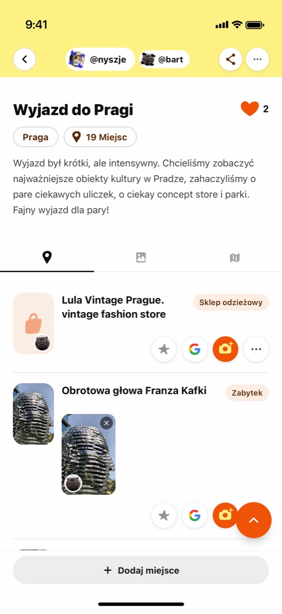
- Notes instead of star ratings. Venue owners told us reviews can be bought (“100 PLN per review”), so travellers write notes for each other, and a star means a personal highlight, not a score.
- One loop instead of many features: explore, save, plan, with notes. Navigation went from five tabs to three. Shared planning came back later as a simple invite to a plan.
- Cost as design material. Search-as-you-type would have cost around 91k PLN a month at 10k users, so I redesigned search to query our own catalogue first and Google only when there are few results.
- Monetisation that never sells ranking. A venue owner named the risk himself (“those with a marketing budget win”), so the paid layer is tools: events, analytics and QR codes for attribution.
- Onboarding as activation. People created a plan and left before adding a place, so onboarding now asks for one collection and one place (3–5 taps), and every step can be skipped. I explored three directions in Figma and picked a different one than the AI recommended.
- Cold-start honesty. With a small catalogue, I removed search for now and put fresh plans and venues with profiles at the top, instead of promising discovery we couldn't deliver yet.
“Those with a marketing budget win.”
04 · Building it with AI
With AI doing the implementation, the bottleneck moved from building to judgement.
- I built the native iOS app, the Supabase backend, the B2B venue panel and an internal admin console with Claude Code.
- The rules I wrote for the agents (brand, copy, i18n and quality gates) became the real design system.
- Seven security audits before submission. Under the hood: about 94k lines of TypeScript, 475 database migrations and 4,260 translation keys in two languages.
05 · UI Design
06 · Takeaways & Next Steps
Submitted to the App Store in early October 2026. Closed beta: about 30 people outside the team, 1,128 curated places in 18 cities, 43 plans and 22 collections, 7 venue profiles with 22 QR codes and 35 scans. Early signals from a small sample: about 9 sessions per person and roughly 25% returning after a week, among about 30 testers. After the submission, I handed the product over to my co-founders running marketing and finance, to take it further.
Recruit for the scenario, not for convenience: both pilot users knew the city, so the core value, discovering unknown places, never had a chance to show. Writing thresholds before interviews kept us honest when results were mixed. And constraints like API pricing, App Store guidelines and GDPR are design inputs, not engineering afterthoughts. Next: a research round with people travelling to a city they don't know, and retention after the public launch.